Project Overview
The client
Accelera Digital Group (ADG) blends world-class engineering with deep business insight, helping organisations scale intelligently, efficiently and securely across advisory, implementation and managed services. They work across Africa, Europe and the Middle East and across industries from financial services and healthcare to gaming and real estate.
The project
A full brand presence rollout. A redesigned website, plus a broad spread of supporting design: presentation decks, marketing material (ads, banners, social posts), print (brochures) and event collateral including exhibition stand design. The connective goal running through all of it was to showcase ADG's brand and, in particular, their partnership with Google Cloud.
The moment
ADG had been named a Google Cloud Partner of the Year. That kind of recognition is a credibility windfall, the sort of third-party endorsement most B2B technology firms spend years chasing. It also came with budget to advertise and build presence, and a clear reason to spend it. The trigger wasn't a broken website. It was a reputation that had suddenly grown, and a presence that needed to catch up to it fast.
The Brief
ADG's ask was practical and broad: create content and design elements across digital, print and events, so they could show up well everywhere a prospect, partner or event audience might encounter them.
Underneath the list of deliverables sat a single organising need. When a company has just been publicly validated at the highest level, the risk isn't obscurity, it's inconsistency. A prospect who sees a sharp ad, then lands on an off-brand slide deck, then picks up a brochure that looks like it came from a different company entirely, quietly loses the thread. The endorsement leaks out through the gaps.
So the through-line for the work was coherence at scale: make sure ADG looked like the calibre of company Google had just said they were, on every surface, without exception. Not one hero asset, but a whole ecosystem pulling in the same direction.
The Approach
A reputation is only as strong as the least polished thing someone encounters. That principle shaped how the work was scoped and sequenced.
Anchor on the partnership
The Google Cloud relationship was one of ADG's truly valuable stories, so it became the thread the collateral was built to carry, foregrounded consistently rather than tucked into a footer.
Design for a spectrum of contexts, one system
A LinkedIn post, a printed brochure, a three-metre exhibition stand and a sales deck ask very different things of a design. The work had to flex across all of them while still reading unmistakably as one brand. That meant building for a system, not a set of one-offs, so ADG's team could keep showing up consistently long after the initial rollout.
Match the audience
ADG sells sophisticated services to enterprise decision-makers across multiple regions and industries. The register throughout had to feel credible, capable and global, confident enough to sit comfortably beside the Google Cloud brand without being overshadowed by it.
The Work
This is a visual-led case study. The sections below frame each surface and the intent behind it. Drop the strongest asset or two into each, and let the work carry the weight.
The website
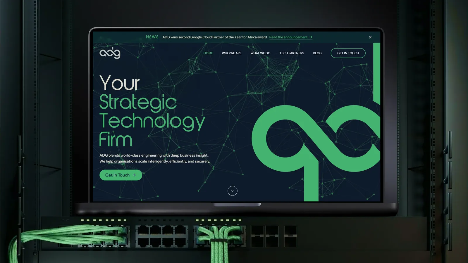
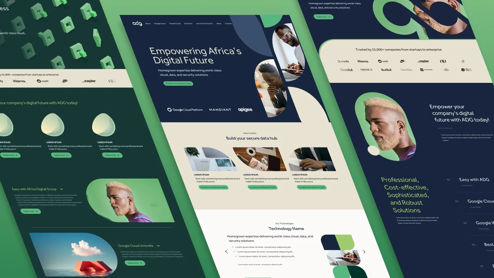
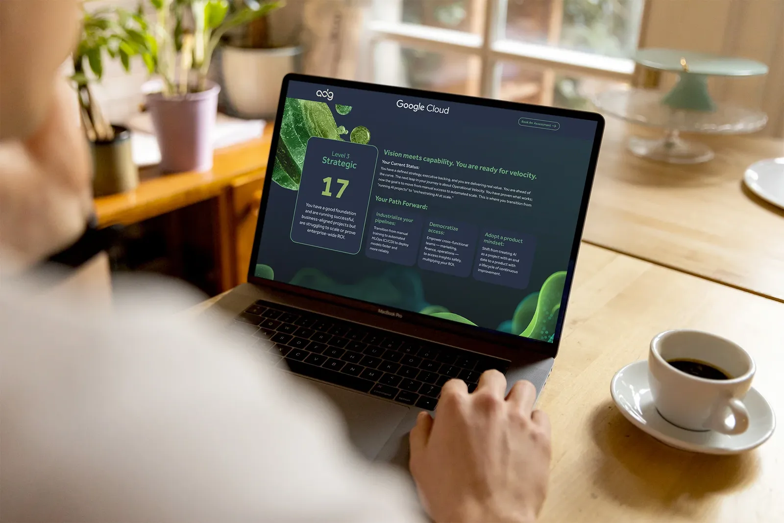
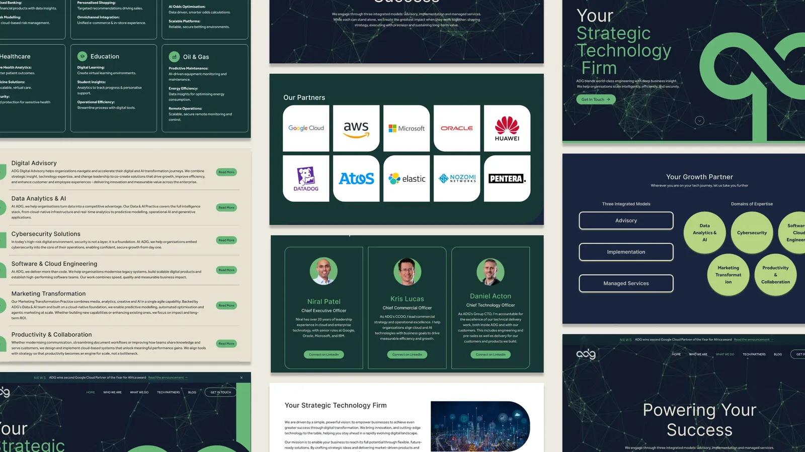
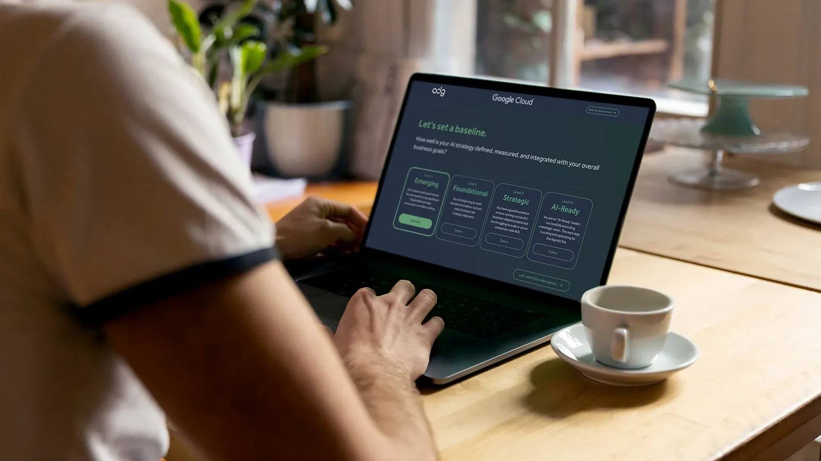
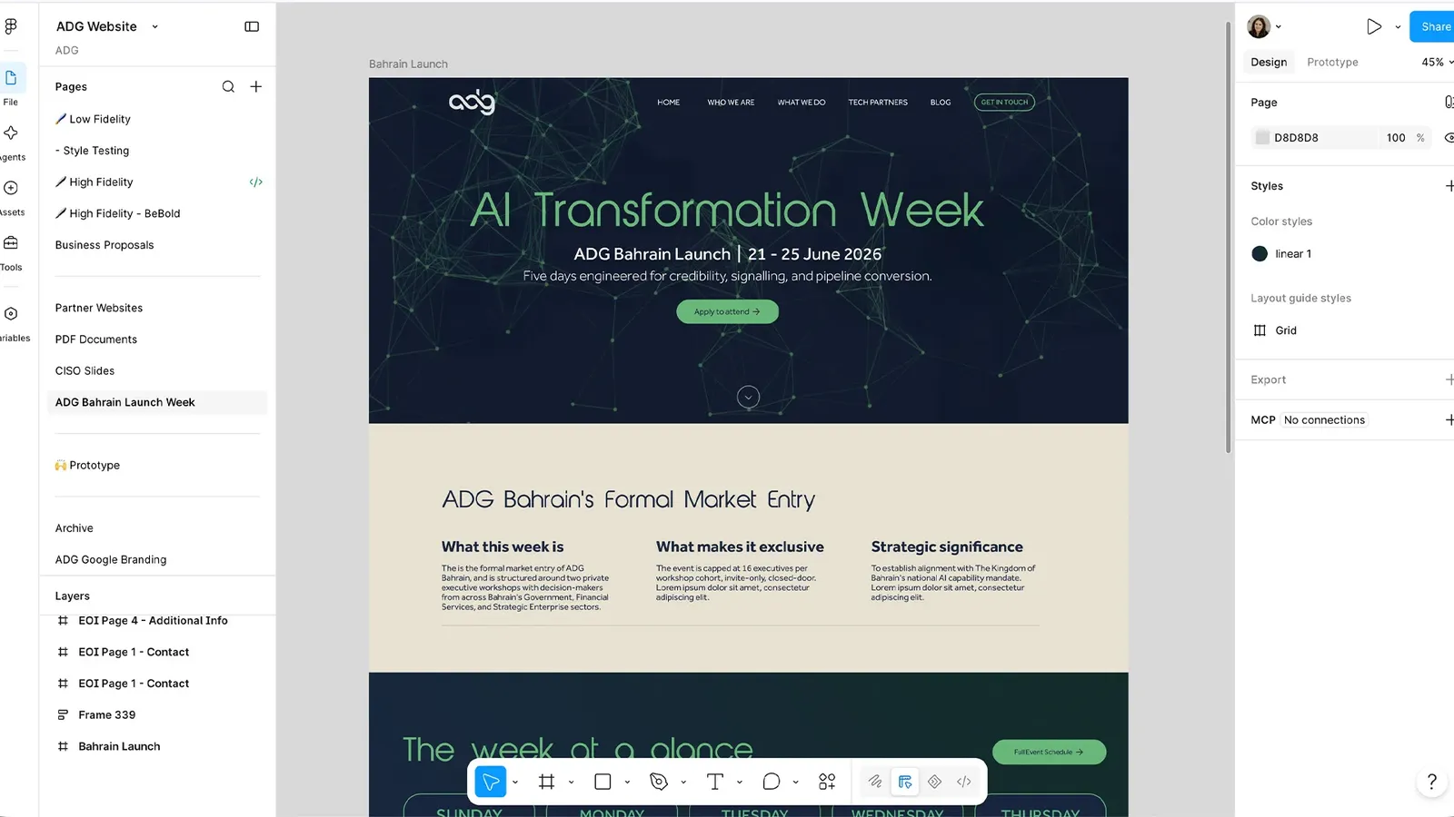
The redesign gave ADG a home that matched their new standing: a clear articulation of the three engagement models (advisory, implementation, managed services), the breadth of industries served, and the global-but-local positioning, all wrapped in a presence that reads as enterprise-grade. The Google Cloud partnership sits where it earns its keep rather than buried below the fold.
Presentation decks
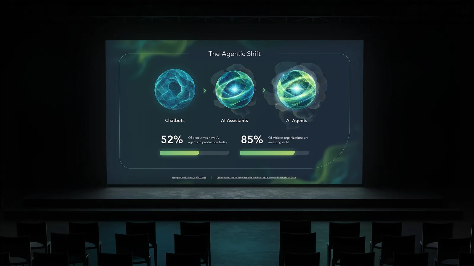
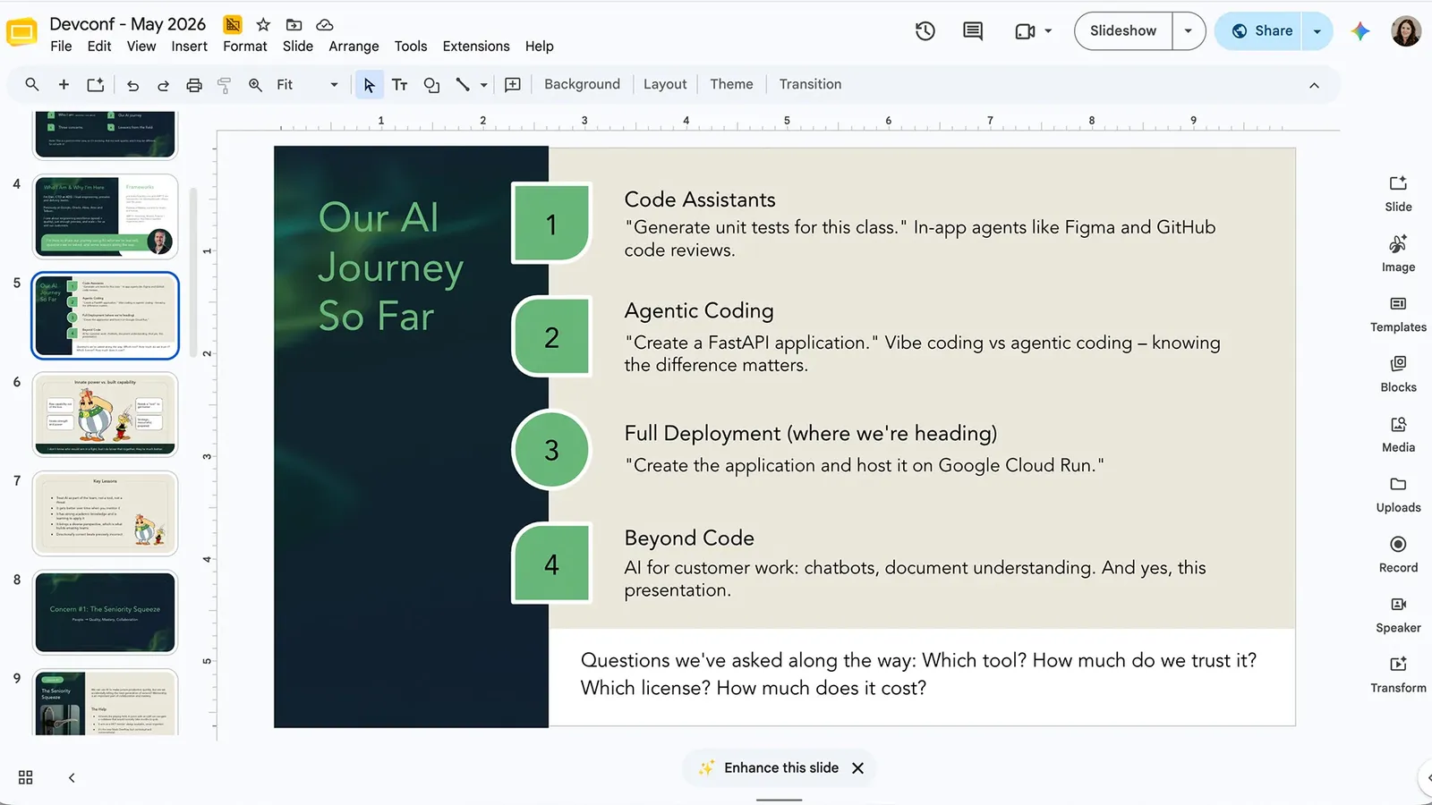
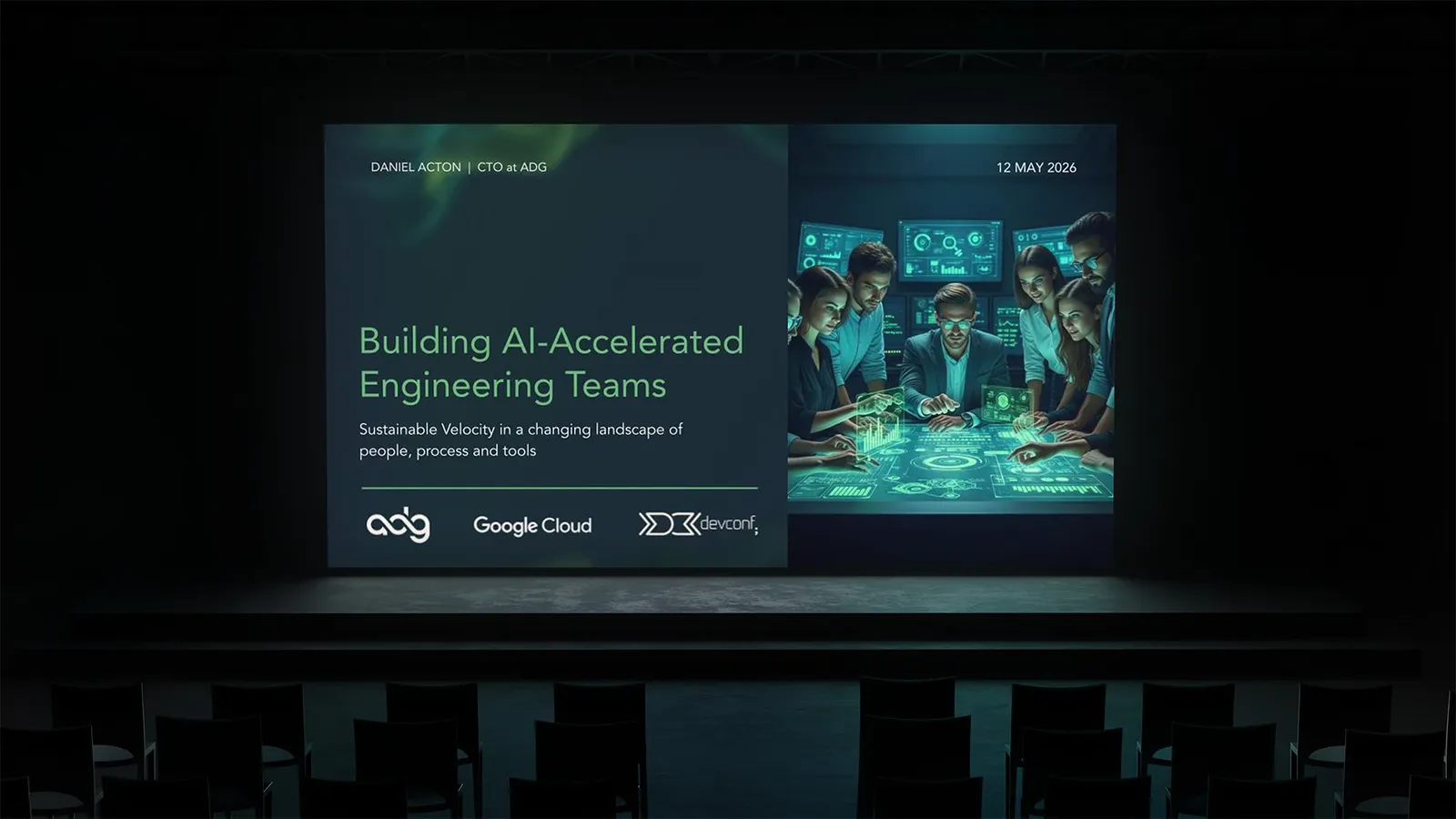
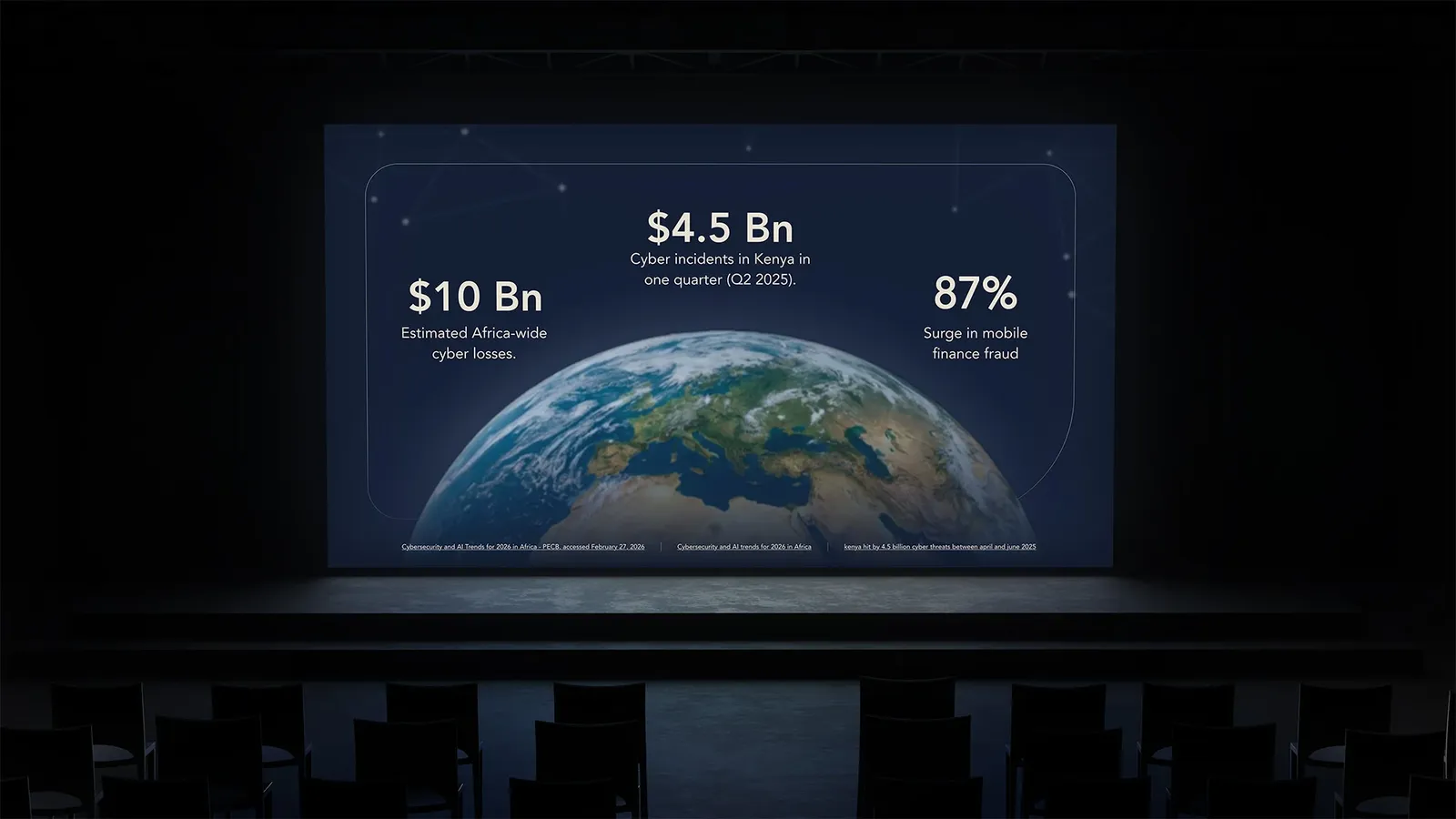
Sales and capability decks are where a lot of B2B deals are actually won or lost, and they're often the most neglected surface in a brand system. Built on a consistent template, ADG's decks let the team present at the same level of polish as the rest of the brand, every time, without rebuilding from scratch for each pitch.
Marketing material
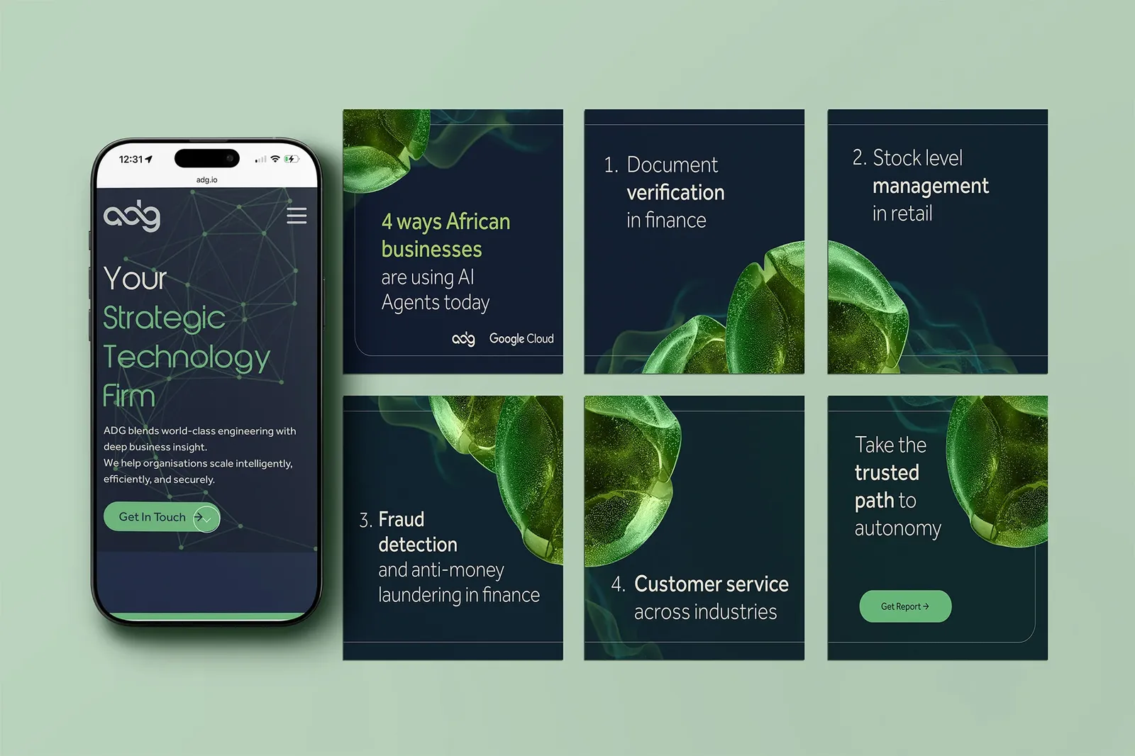
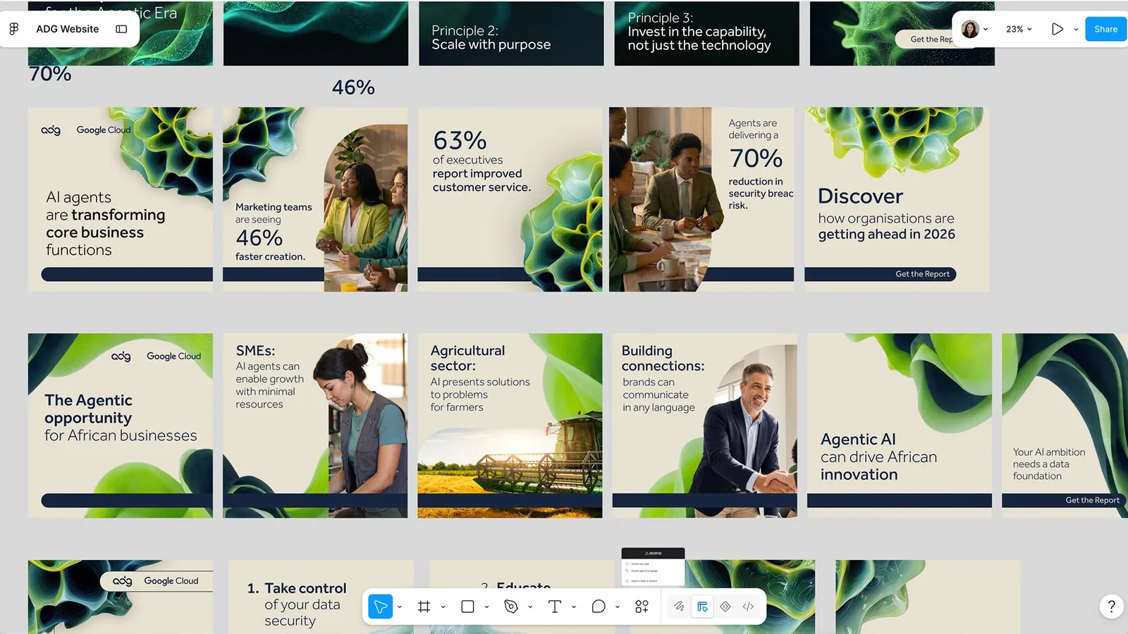
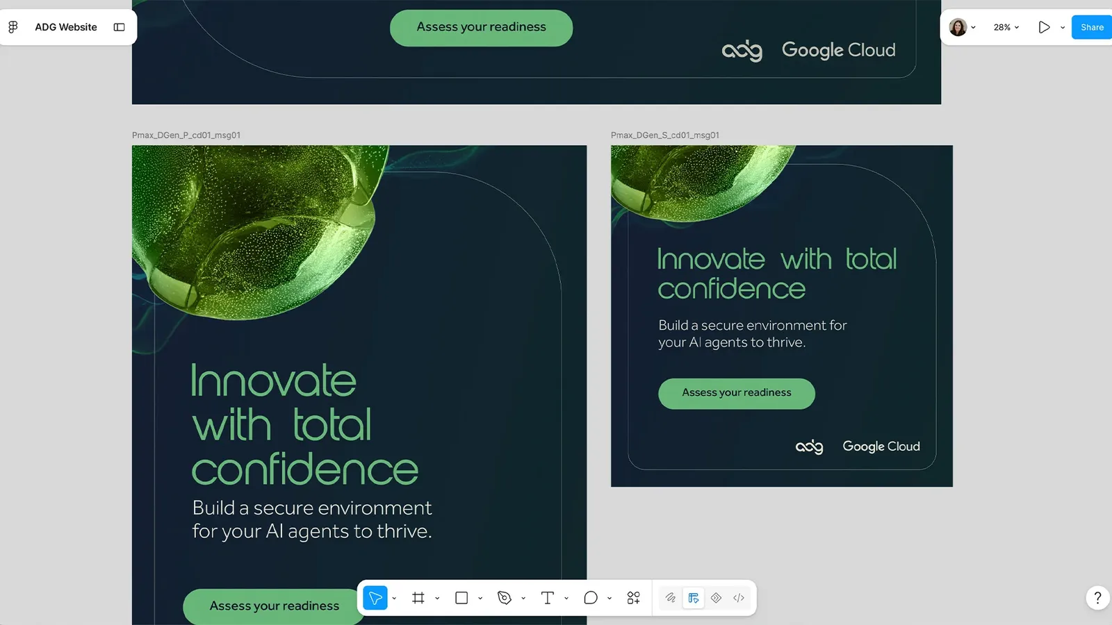
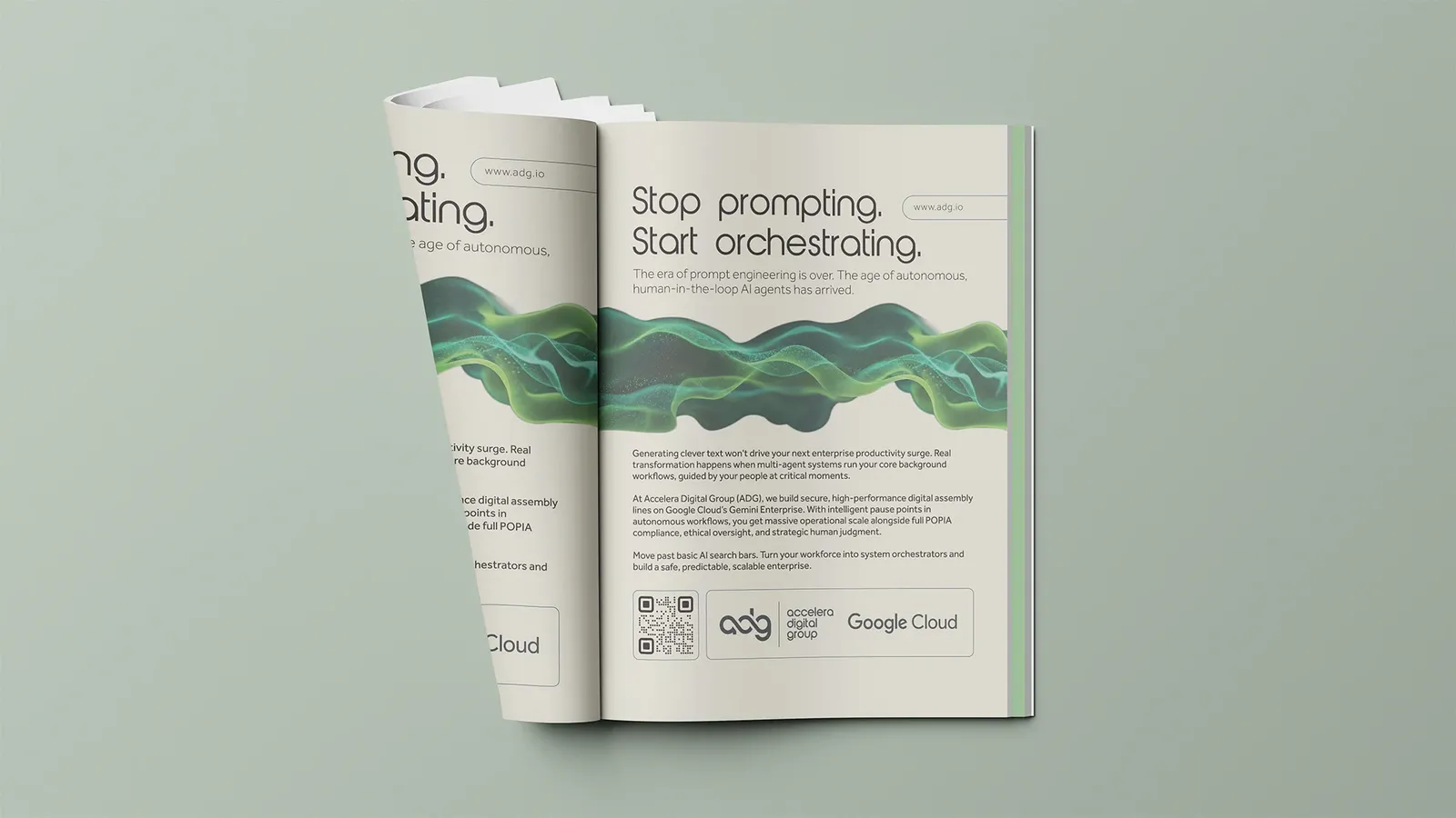
Ads, banners and social posts had to grab attention in crowded feeds and placements while staying unmistakably ADG. This is where the value of a system shows most clearly: many pieces, many formats, one coherent voice.
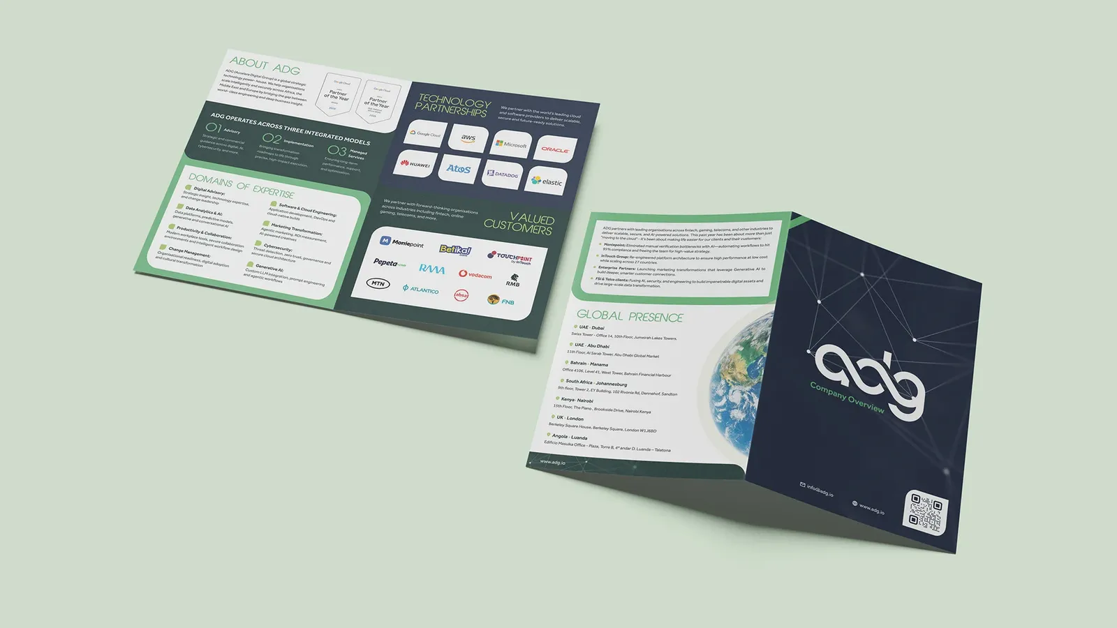

Brochures gave ADG something considered to leave behind after a meeting or hand over at an event. Print holds a different kind of trust to digital: it's tangible, it lingers on a desk, and its quality is felt as much as seen.
Event collateral
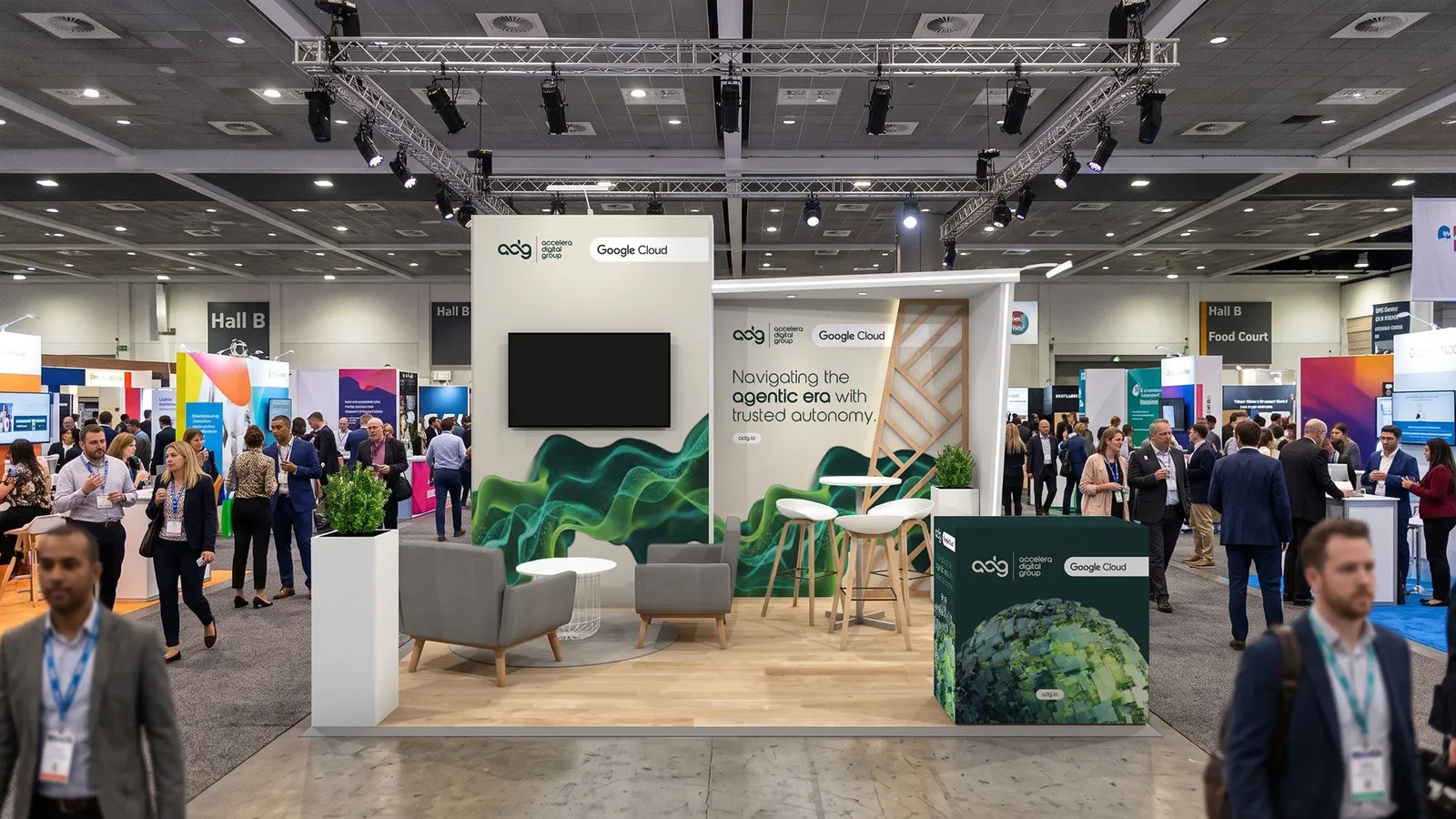
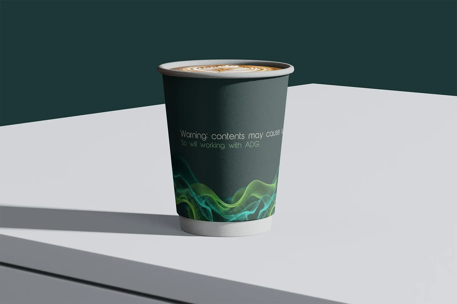
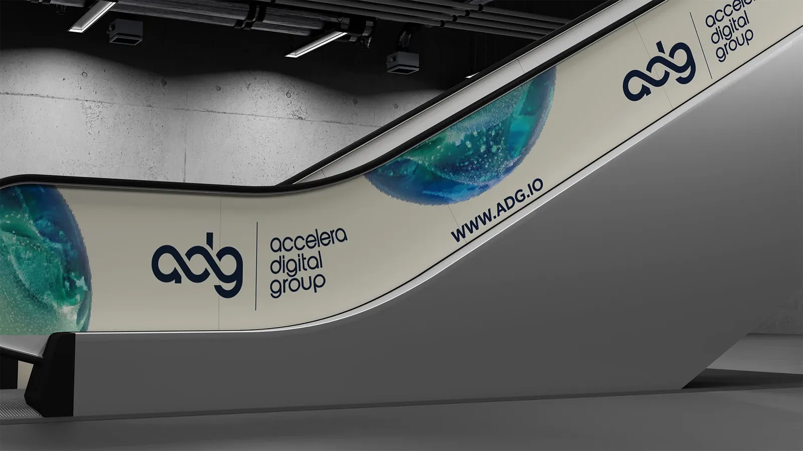
Exhibition stand design took the brand into physical, three-dimensional space, where the job is to draw people in from across a busy hall and communicate who ADG is in the few seconds it takes someone to walk past. At the scale of an event stand, brand consistency stops being a nicety and becomes the thing that makes a company look established rather than improvised.
The thread that ties it together
Across screens, print and physical space, the work holds together as one brand. That consistency is the quiet achievement of a project like this: not any single asset, but the fact that all of them feel like they belong to the same confident, capable company, the one Google chose to recognise.
Closing Reflection
Not every project is a puzzle to be solved. Some are a reputation to uphold. ADG had earned a genuine mark of distinction, and our job was to ensure that distinction translated consistently everywhere its name appeared: from a scroll-stopping ad to a boardroom brochure to an exhibition stand. When the story is this strong, the design simply needs to carry it faithfully at scale, without a single weak touchpoint undercutting the brand.
Visit the ADG website: www.adg.io