Project Overview
The client
Gridix is a prepaid electricity submeter for sublets, flats and multi-unit properties, built by Utility Revenue Systems (URS), a utility-technology company that has run revenue and metering systems for cities and property owners for over twenty years.
The project
Naming, brand identity, and packaging, from a blank page to a print-ready sleeve. Three disciplines, one product, delivered as a single arc.
The situation
URS had spotted a gap. Rather than keep relying on third-party meters, they'd build and sell their own. The product was sound and the market was real. What it didn't have yet was a name, a face, or a box, and the shelf it was heading for was a sea of near-identical competitors, all loud, all crowded, all saying roughly the same thing in roughly the same white, blue and green.
The Brief and the Reframe
Their ask was refreshingly grounded: give us a name that sounds right and works in the market, a brand that feels a step above the generic competition, and packaging that ships the product. No grand narrative required. In their own framing, a submeter isn't a lifestyle choice, and they weren't looking to build a cult around one.
We agreed, and that agreement is the reframe. The temptation on a project like this is to manufacture depth the product doesn't have, to hunt for an emotional story where there isn't one. The more useful reading was the opposite: the job wasn't to add meaning, it was to earn trust through clarity. The buyer here isn't an enthusiast. It's a landlord or property manager asking one quiet question at the point of sale: does this look and feel premium enough to do the job at this price? Answer that with confidence, and you've won. Everything else is fluff that gets in the way of it.
So the brief became: build an accessible but distinctive brand that reads as competent and premium in a category that has confused "more information" with "more trustworthy" for years.
Discovery: The Shelf Was Doing Our Work For Us
Two observations shaped every decision that followed.
The category competes by shouting
Look at the existing submeter packaging and it's the same story repeated: overcrowded boxes, everything fighting for attention at once, no hierarchy, no breathing room. The colours are loud, the layouts are dense, and the net effect is a shopper who feels vaguely uneasy without knowing why, and often doesn't pick the thing up. In a market that noisy, restraint isn't a soft choice. It's the loudest thing you can do.
Their brand’s own colours were already a differentiator
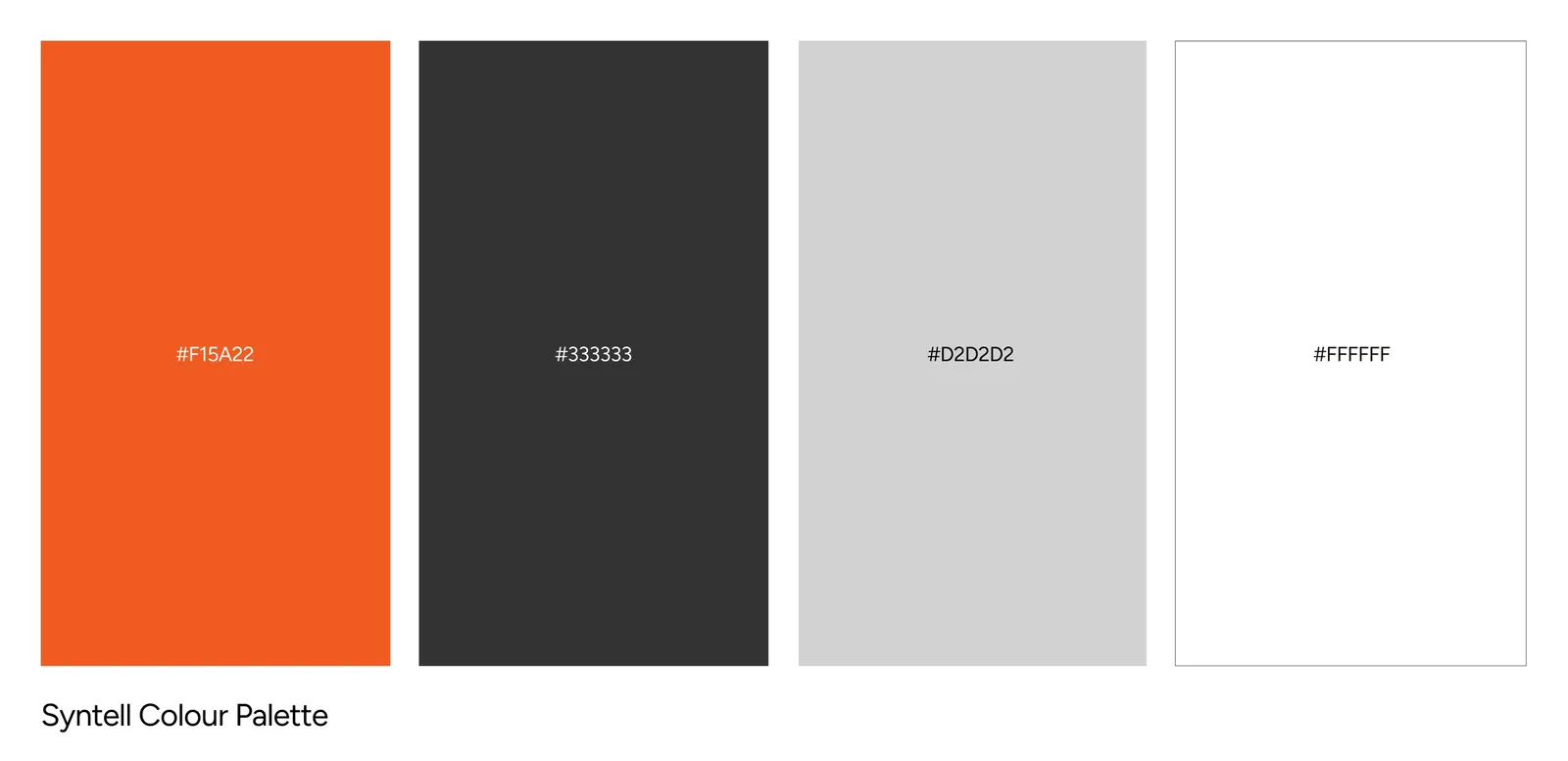
Because Gridix sits under URS brand, it inherits a charcoal-and-orange palette. Set that beside a shelf of white, blue and green, and it already looks like a different class of object, sleeker, more considered, more premium at a glance. We didn't need a colour-psychology exercise. The contrast was sitting there waiting to be used. Our job was to not waste it by cluttering it.
The audience has a useful split, too
The person who buys Gridix is the property owner or manager. But the person who first spots it on the shelf at the builder's warehouse is often the electrician or contractor, who then recommends it upward. So the packaging had to earn a professional's quick trust and a manager's considered buy-in at once. That's a design problem with a clear answer: look credible fast, then reward a closer read.
The Strategy
One principle ran through naming, brand and packaging alike: say what it is, remove what doesn't help, and let the clarity read as quality. In a category that equates crowding with value, a clean, confident, minimal execution would signal premium more effectively than any amount of added copy or ornament. The palette was inherited, the message was simple, and the discipline was subtraction. Every decision downstream was a version of the same question: does this earn trust, or just fill space?
Design: The Decisions That Shaped It
The name: saying the quiet part out loud
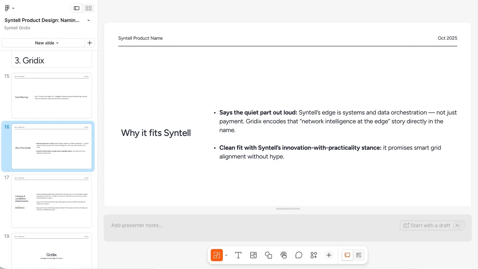
Gridix pairs "grid" with the "-ix" suffix native to enterprise tech. It reads as intelligent, grid-grade infrastructure rather than a payment gadget, which is precisely URS’s real edge: systems and data orchestration, not just billing. Where competitors lean civic or transactional, Gridix plants a flag in competence, the quality that matters most to the facilities teams and installers who care about interoperability and uptime.
Getting there was a proper team effort, and a lesson in the value of a second pass. We researched the language of electricity and infrastructure, built shortlists of real and invented words, and pitched a first round. URS did the right, disciplined thing and trademark-tested it before falling in love. When the front-runner wasn't clear, we ran a second session together, and the name that survived, Gridix, had actually come from the very first round. Sometimes the answer is already in the room; it just needs the process to prove it.
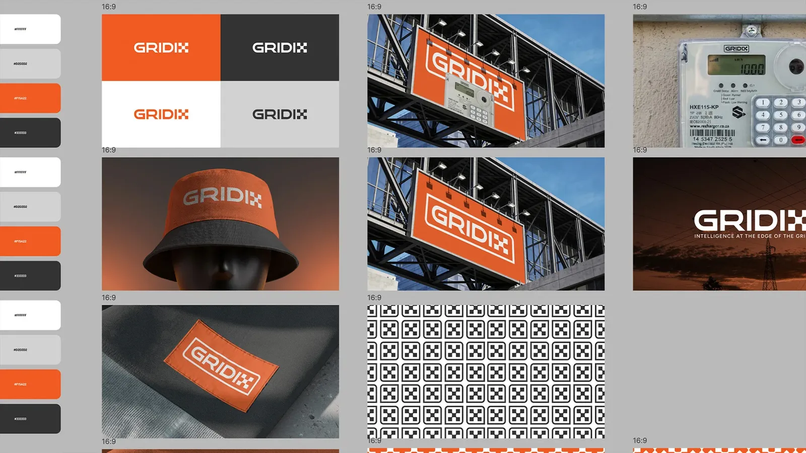
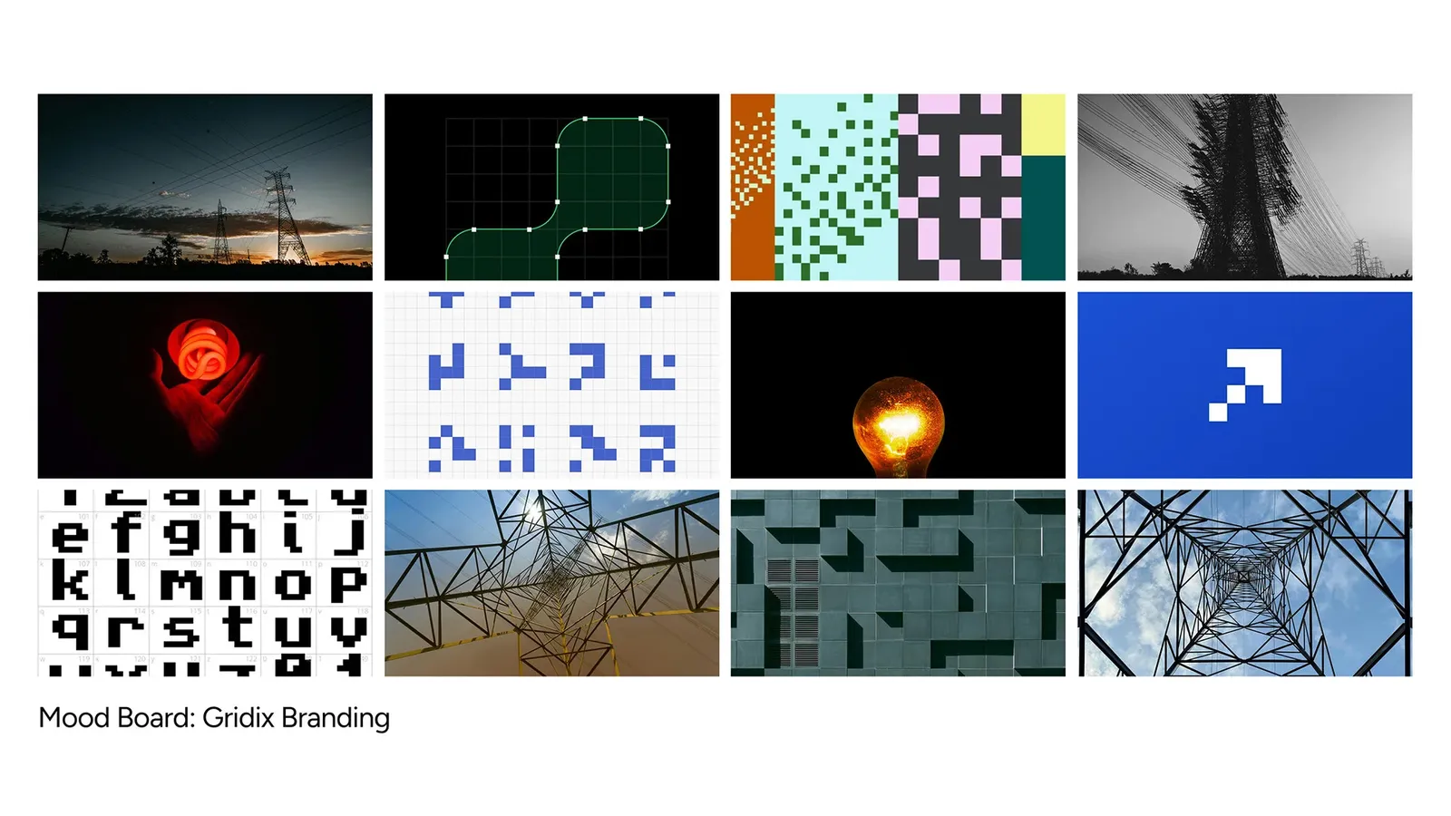
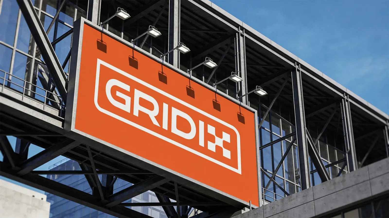
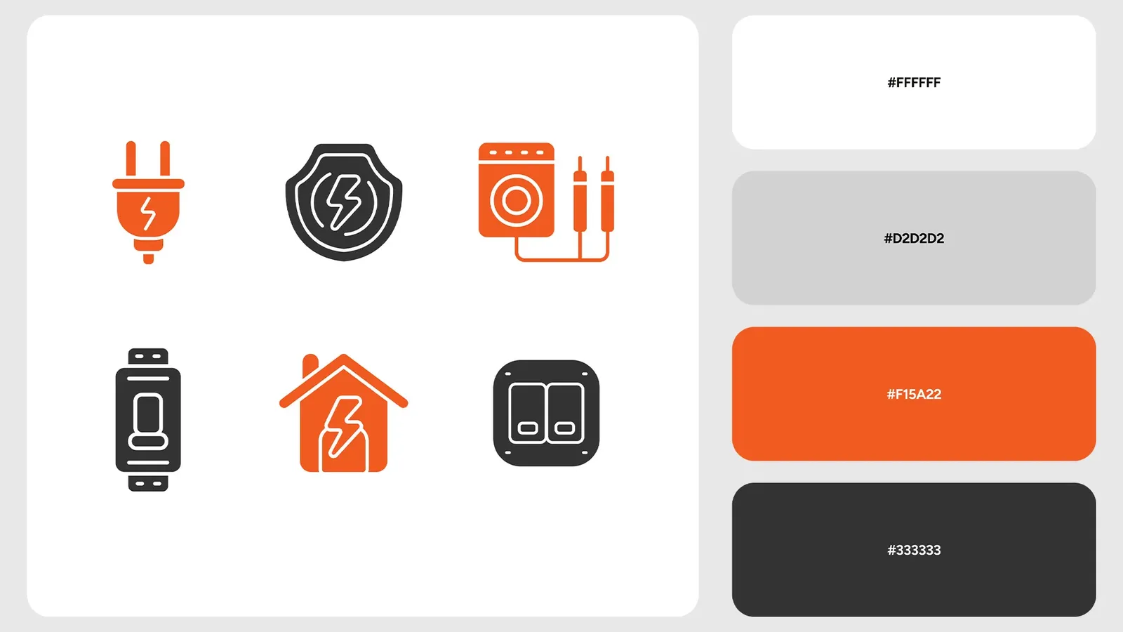
The logo: resisting the lightning bolt
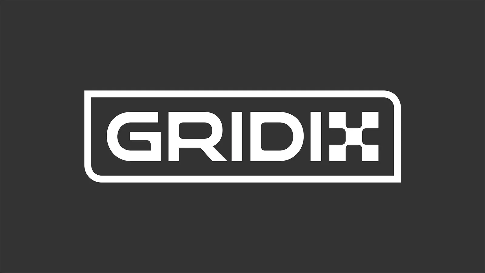
Almost every competitor reaches for the obvious: a lightning bolt, on the nose, instantly forgettable because everyone has one. We built the identity from the "grid" instead, a small stacked-block, checkerboard-derived mark that nods to an electricity grid without spelling it out, with the "x" reading as a techie, stacked motif. It's quieter, more distinctive, and, usefully, more flexible: the block system gives the brand a visual language it can extend across executions rather than a single literal symbol. The mark was also tuned to sit comfortably beneath URS’s own parent logo, echoing its confidence without copying its style, so the two read as family.
Restraint, again, was the discriminator. The product's audience isn't expecting a work of art on a utility meter. The simple, functional elements are exactly what resonate, so long as they're executed with more care than the competition bothers to show.
The packaging: subtraction as the whole idea
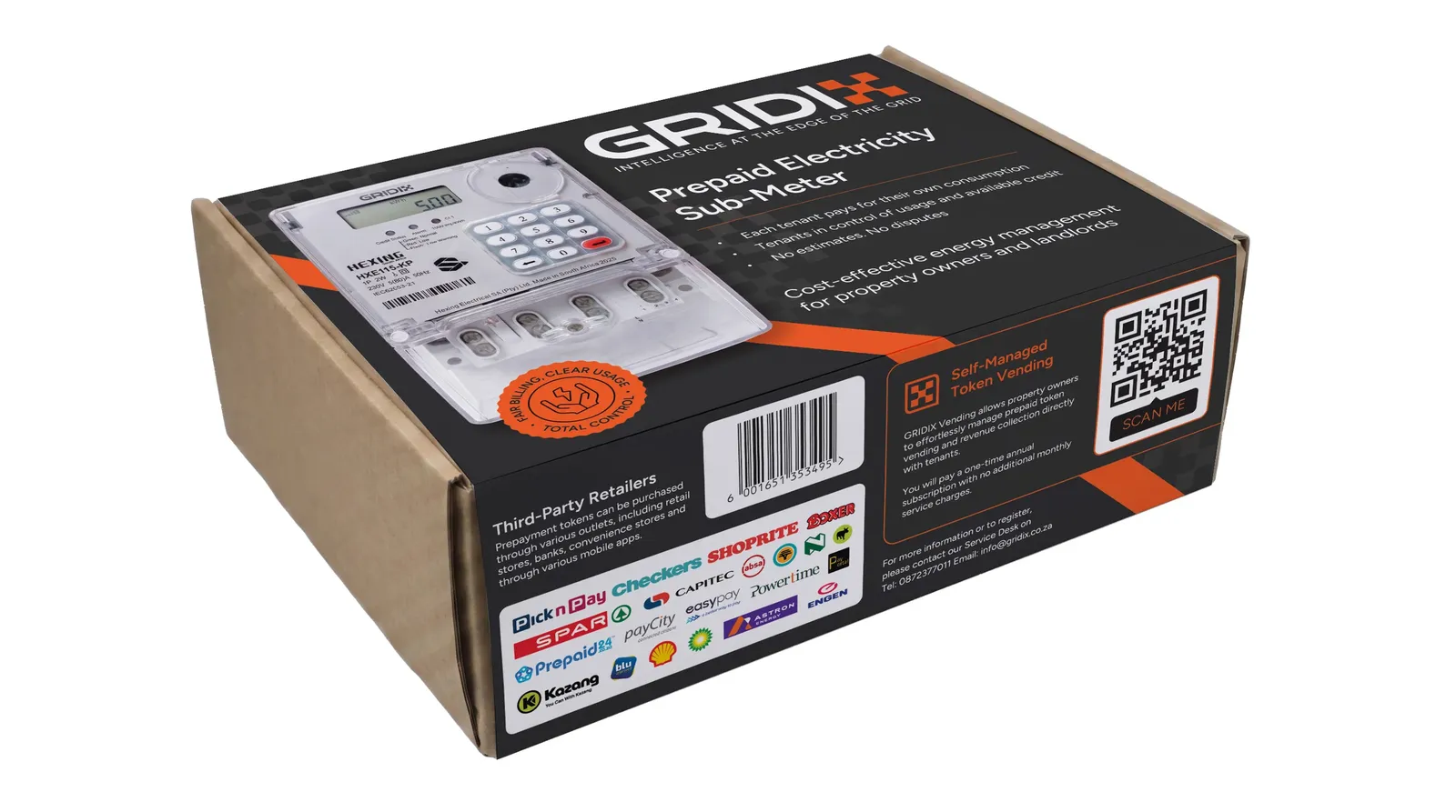
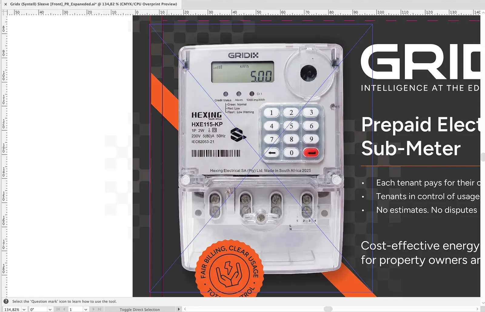
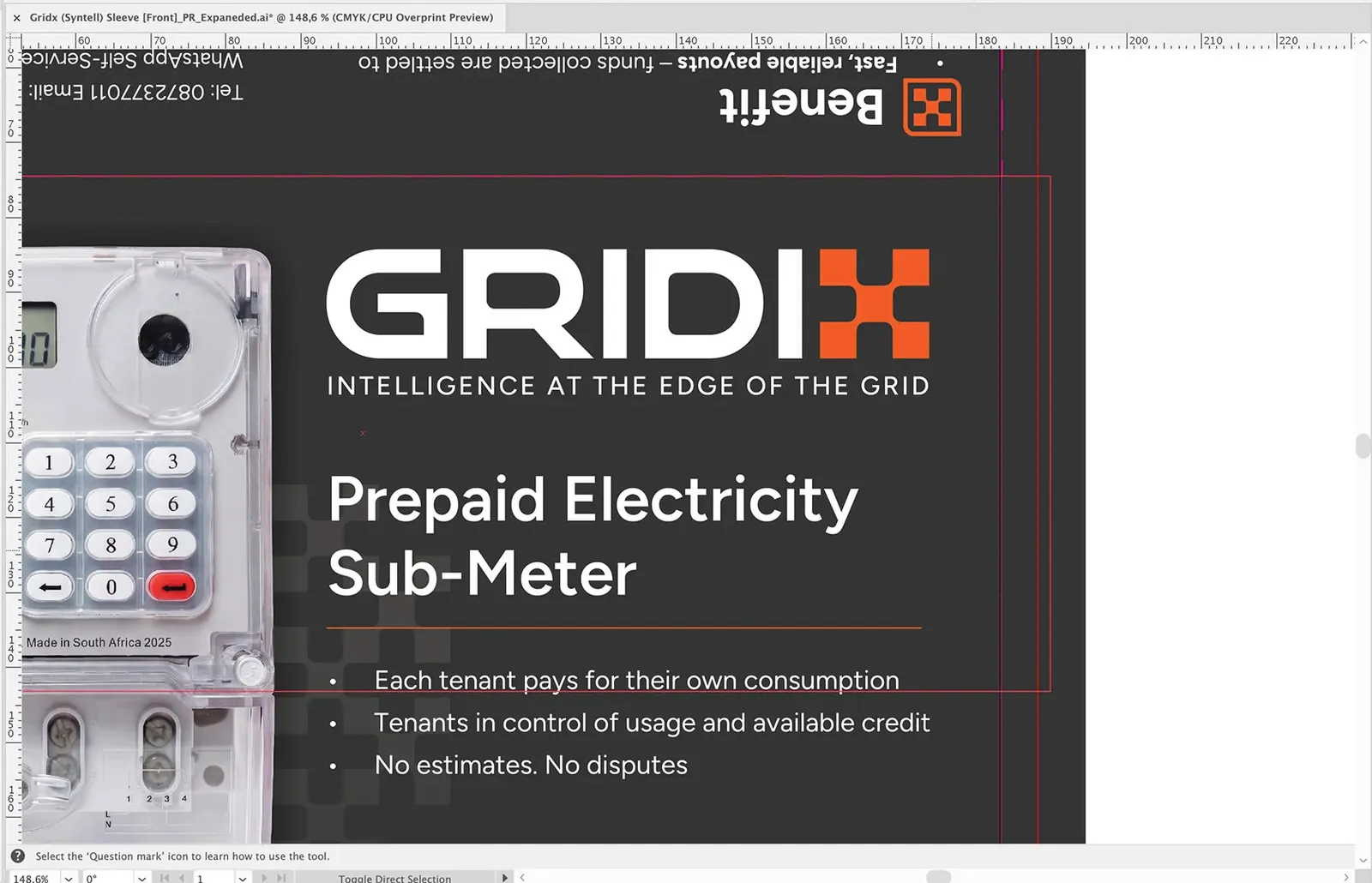
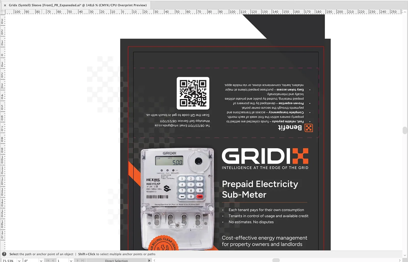
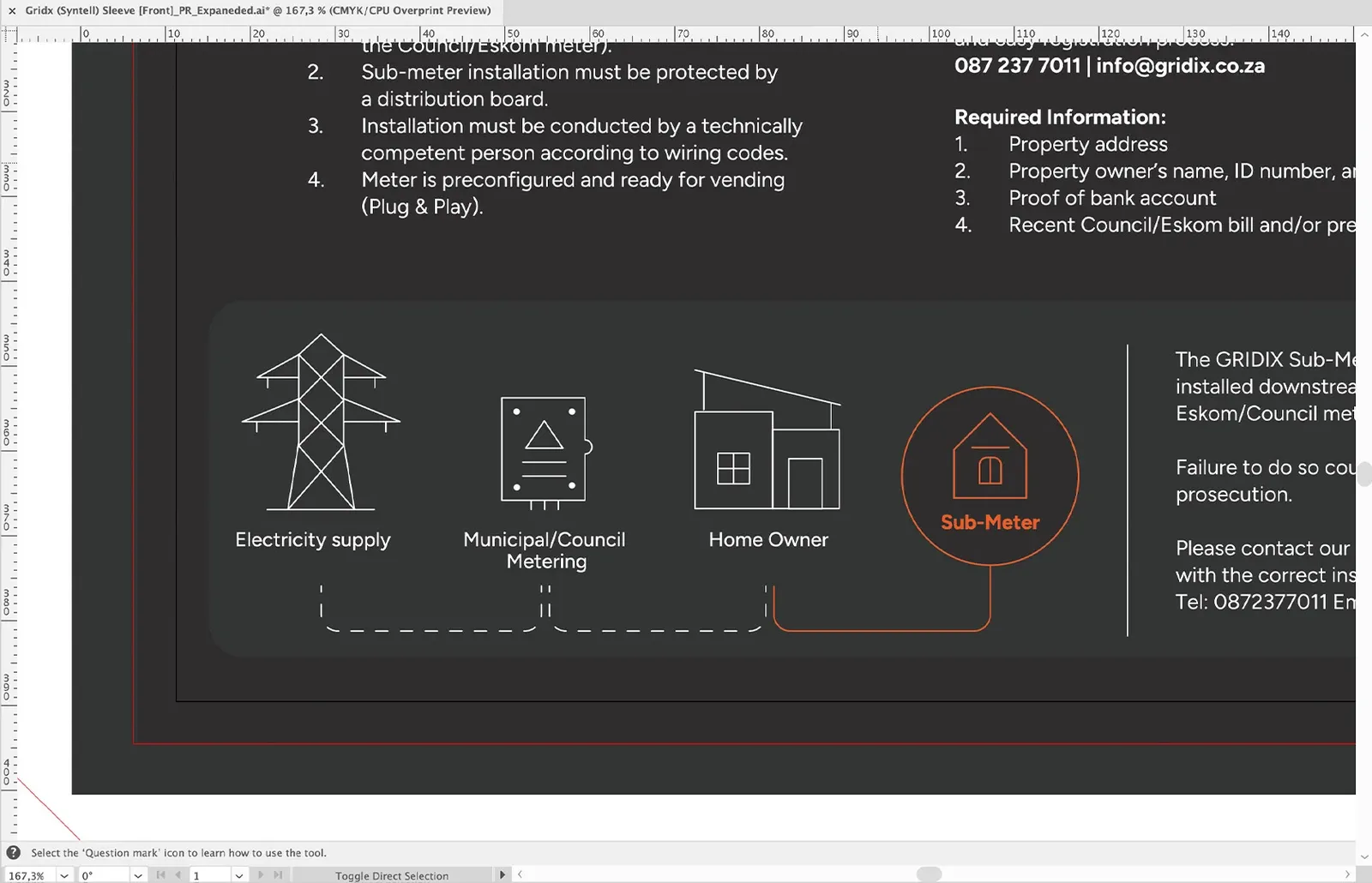
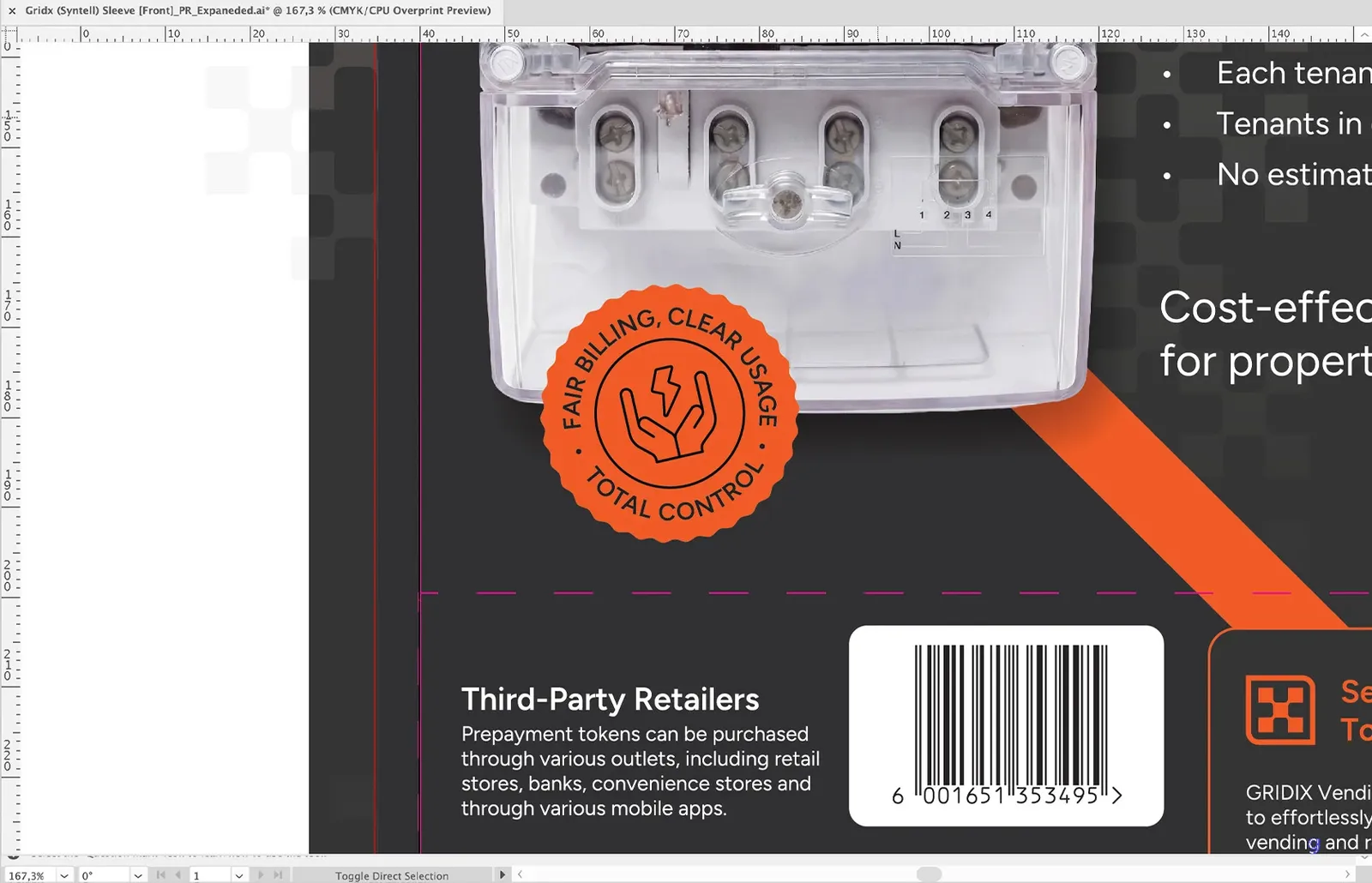
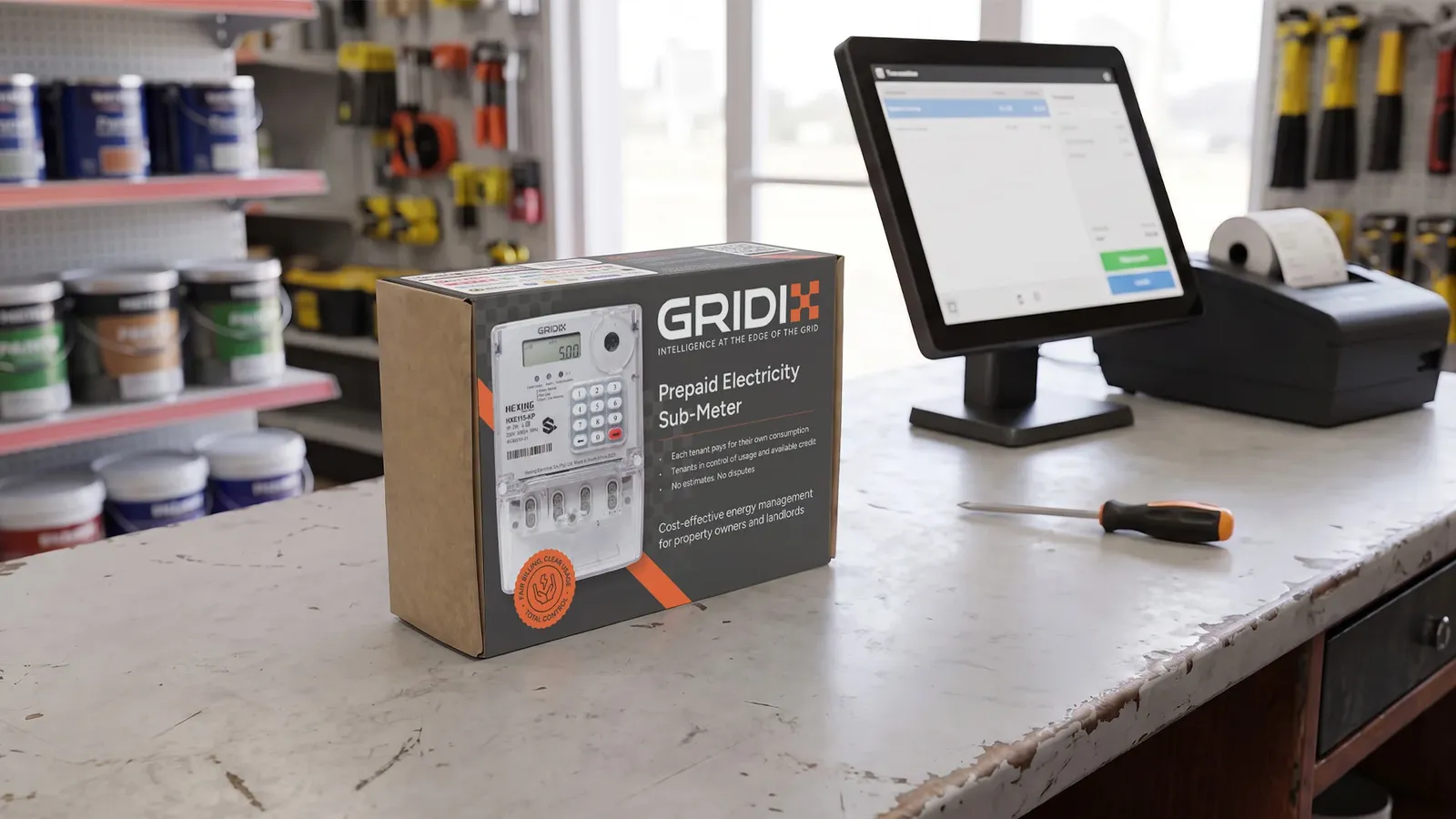
The competitor sleeves stack everything they can. We did the reverse, and made minimalism the premium signal. A basic layout was developed in a few controlled variations rather than three wildly different directions, keeping it clean, modern and less overwhelming than anything else on the shelf. The result reads as ‘considered’, whereas the rest read as ‘busy’. A few decisions carried it:
We treated the client's instinct to add as something to guide, not obey
The natural pull was to cram in every logo, every line, the full terms and conditions. But more on the box isn't more trust; without hierarchy and breathing space, a shopper just feels uneasy. So third-party vendor logos were cut to a recognisable few (top retailers and banks) that actually build trust rather than clutter, and the inner registration form got shortened, more legible terms so it read as reputable rather than shady.
We kept the conventions that matter and cut the ones that don't
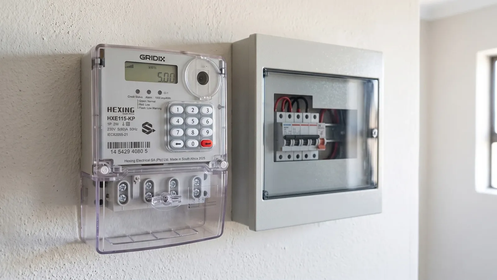
Showing the actual unit on the front stays, because with electronics, as with food, people want to see what they're buying before they'll trust the box. The back-panel supply diagram was simplified to a clean flow (supply → municipality → homeowner → submeter) and picked out in the brand orange, carrying the one message the installer needs: this replaces the council meter.
We made the differentiator impossible to miss
URS’s real commercial edge is a lower-cost bulk token vending option. That got pulled out, boxed, and highlighted in orange so the single most persuasive fact on the sleeve reads first, not buried in body copy.
And we pushed premium into the physical object
UV spot varnish on the logo and meter to draw the eye and add tactility, with the option of an overall varnish for durability and water resistance across large print runs. The client hasn't committed to the finishes yet, and that's fair for the price point, but the principle stands: on a shelf where nothing else invites a touch, a sleeve that feels considered does quiet persuasive work a flat box can't.
What We Learned
When a whole category shouts, the quiet product wins the shelf
Every competitor had confused density with value. By stripping back to hierarchy, breathing room and a confident palette, Gridix reads as the premium option without a single "premium" claim. Subtraction did what a louder box never could.
Match the depth of the branding to the depth of the decision
Not every product needs a story, and forcing one onto a submeter would have been effort spent making the client and the shopper work harder for no return. Recognising that the real job was clarity and confidence, not narrative, is what kept the work honest and effective. The discipline is knowing when restraint is the right answer, not just the easy one.
Design for who spots it, not only who buys it
The split audience (installer at the warehouse, manager signing off) meant the packaging had to earn fast professional trust and reward a considered second look at once. Naming the actual humans in the purchase, rather than a generic "customer", is what made the hierarchy decisions obvious.
Handing a brand off to packaging is its own discipline
This was our first project taken all the way from naming through branding into a physical, print-ready product, and with several designers on one job. The handoff between "here's the brand" and "here's how it lives on a folded sleeve" has gaps that a screen-based workflow never exposes, and working through them as a team, giving and defending decisions out loud, made the end result steadier than any one person's version would have been. More eyes, less forest-for-the-trees.
Closing Reflection
The easy move on a project like Gridix is to add: more meaning, more message, more box. The harder and better move was to trust that in a category drowning in noise, a clear name, a confident mark and a calm, well-made sleeve would say "premium" more convincingly than any claim printed on the front. Gridix didn't need a story. It needed to be understood at a glance and trusted on sight, and that is exactly what good design, used with restraint, is for.