Project Overview
Our Client
MyNextRide is setting out to build South Africa's most trusted Toyota and Lexus marketplace. Every vehicle is verified, the total cost is on the table, and the whole deal is done online, from inspection to delivery.
The Project
Brand strategy → brand identity system → logo suite and visual language, designed to make buying a used Toyota feel as safe and dependable as the car itself.
Scope and Deliverables
- Brand strategy: market and competitor review, positioning, audience segments, personality and visual principles.
- Identity system: a logo suite with a primary logo, icon, secondary logo and wordmark, plus colour, typography and logo rules.
- Brand guidelines: a guidelines document covering logo use, colour, typography and button styles, ready for the platform build.
The Brief
The South African used-car market runs on three problems: opacity, risk and wasted time. Fees are hidden, service histories are incomplete, and defects surface after the money has changed hands. Payment is uncertain, "sold as is" is standard practice, and buyers have to fend for themselves.
Generic classifieds list everything from a bakkie to a Bentley with no standards. Facebook and WhatsApp groups have no verification at all, and scams are common. Auction platforms require a dealer licence. For the buyer, it comes down to this: the car looks good and you've done all the research you can. For the rest, you have to shut your eyes, cross your fingers and hope the gearbox lasts a few more years.
MyNextRide came to Inkblot with a focused idea: a marketplace for Toyotas only. Toyota holds around 30% of South Africa's passenger vehicle market. The Hilux, Corolla and Fortuner are consistently among the country's top sellers, and Toyotas hold their resale value better than any other brand locally. People choose Toyota because it is dependable.
That contradiction was the starting point for the project. People buy Toyotas because they want a vehicle they can trust, but the used-car buying process forces them to take on a risk. And no-one wants to discover they've just bought themselves a skedonk.
The strategy set out what would make MyNextRide different: verified vehicles, transparent total cost, warranties and concierge-style logistics. None of that shows in a listing, so the brand had to show it the moment a visitor lands on the site.
The car analogy to the client: "A logo is the engine, not the car. An engine is absolutely essential, but on its own it won't get you going." So we started with the strategy and built the rest of the brand around it.
What had to be true
- No borrowed trust. Toyota trademarks, colours and visual assets were off-limits, both as a matter of positioning and because using them risked trademark infringement.
- No auto clip-art. Car silhouettes, speedometer needles, tyre treads, gears, wings, shields, keys, road swooshes, racing stripes and italic "fast" marks were excluded from the start.
- Calm, not loud. The brand could not be flashy, salesy, smug, vague or bargain-bin.
- Evidence-forward. Inspection badges, cost tables and measurements needed space in the system.
- Mobile first. The platform would be used mainly on phones, so every element had to hold up at small sizes.
Discovery
MyNextRide came to the project well prepared. The client shared a list of reference websites, from South African Toyota dealerships to international Toyota sites, along with early logo explorations. We added a review of the South African used-vehicle market and a competitive scan of local and international automotive brands.
The customer's problem is risk
The generic marketplaces compete on breadth and price. None of them publish standards, and the risk stays with the buyer. The brand had to signal certainty. This reframed the positioning from "marketplace" to "managed exchange".
The category is dressed up in clichés
A scan of South African automotive brands showed the same devices again and again: red as the dominant colour, italic or slanted type, car silhouettes, swooshes and shields. Distinctiveness would come from what the identity left out, and every auto cliché was something to steer clear of.
The client's early ideas showed what to keep
The client's logo explorations took a creative approach to category conventions: the Toyota emblem inside a garage shape, handshakes over car fronts, speedometer arcs over the wordmark, shields and roundels, and a predominantly red and black palette. The MNR initials appeared in most of the explorations. This showed something they were already attached to, and it became a strong consideration for the identity's direction.
Apple also appeared on the client's reference list. It points to a benchmark from consumer technology: minimalistic design, clear information, plain pricing and a brand you can trust when you’re making a big purchase online.
The Strategy
Every design decision was tested against one feeling: calm confidence with a practical streak. Any element that felt fast, loud, salesy or decorative without doing a job would fail the test.
The identity was built on one line: "Toyota trust, digital-first simplicity, transparent experience." The brand's promise: "The Toyota you want, with the certainty you need."
The brand's personality is the Expert Friend. It knows its subject and explains it plainly. It is competent without being condescending and trustworthy without being corporate.
The strategy defined four buyer segments: Family Upgrader, Budget Commuter, Adventure Owner and SME/Fleet. The Adventure Owner (Hilux, Fortuner and Land Cruiser buyers) shaped an important part of the visual language.
Design: The Decisions That Shaped It
Two creative directions
We presented two creative directions, each with its own moodboard, colour palette and two logo options.
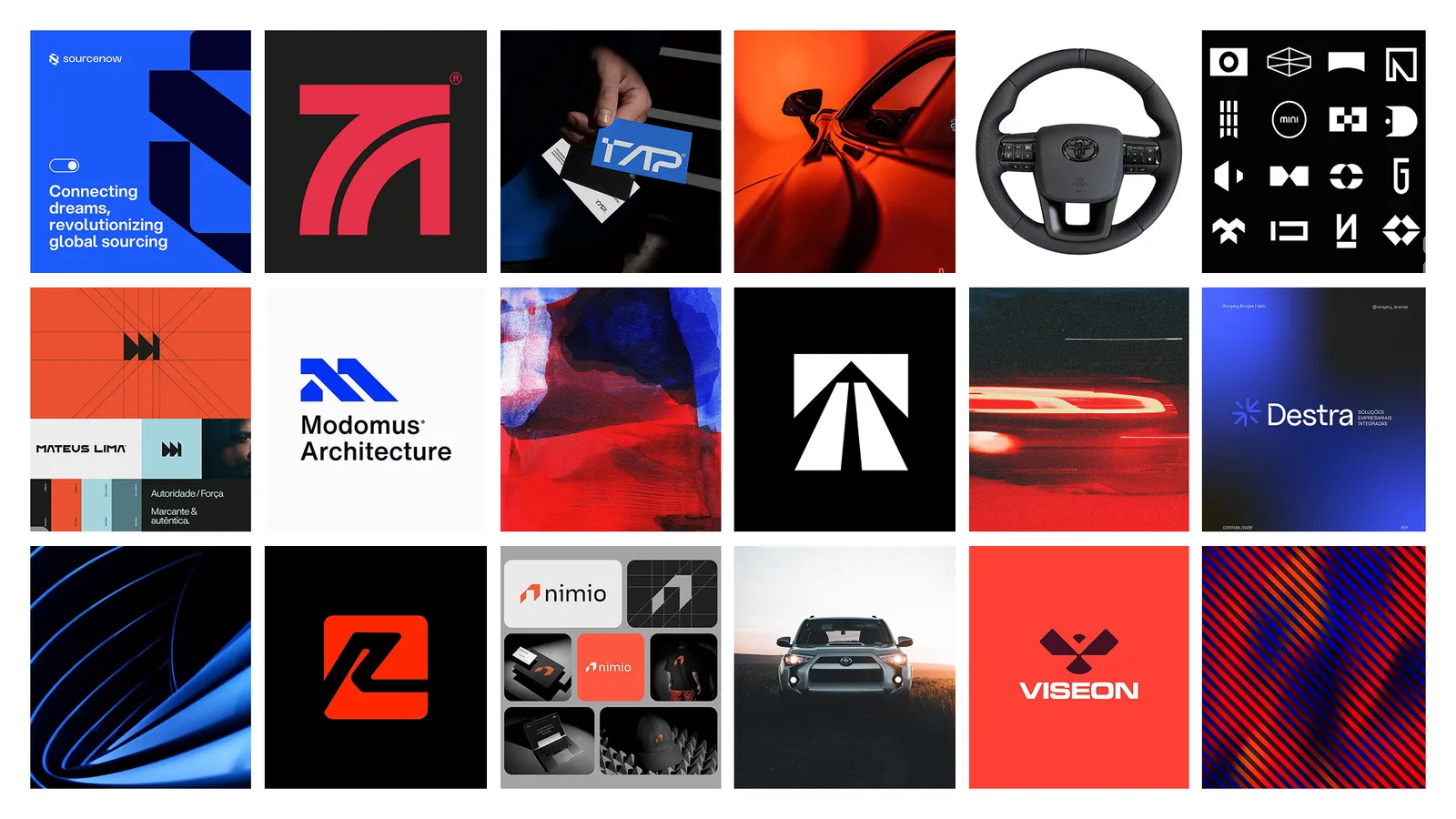
Direction 1: Modern mobility. Modular geometry, disciplined grids and cool tech-blues to signal precision and ease, with a restrained red accent for momentum. The aim was "streamlined, verified and fast to act" rather than hard sell. The palette paired charcoal and deep teal with aqua, soft greys and an orange accent. The logo options were a mark built from continuous rounded strokes, like a mapped route, and a modular system of stacked panels that read as lanes or progress bars.
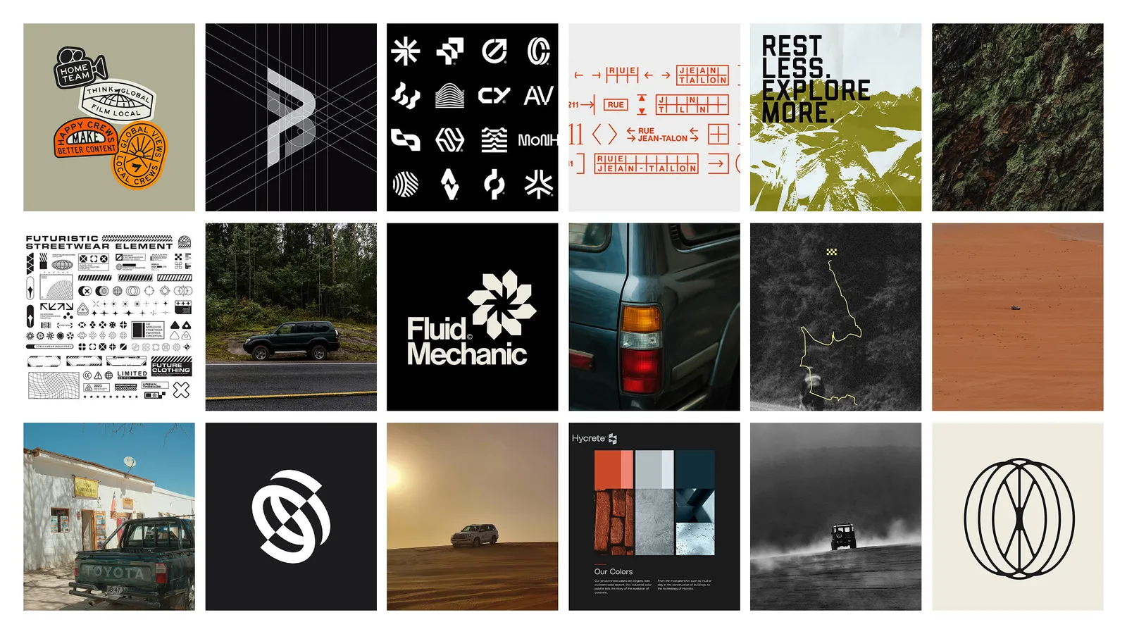
Direction 2: Credible adventure. The visual language of South African terrain, without the macho posturing that can put off families and first-time buyers. Rugged cues were paired with calm typography so the brand felt capable and trustworthy, not loud and risky. The palette used charcoal, two deep bushveld greens, sage and stone, with a burnt-orange accent that nods to Kalahari dust and sunset light. The logo options were a zig-zag terrain mark and a heavy, engineered MNR monogram.
The final identity takes the MNR monogram from Direction 2 and the teal-led palette from Direction 1. The monogram was the most distinctive option in the South African automotive landscape, it did not imitate Toyota in any way, and it built directly on the MNR initials the client had been working with from the start.
The logo
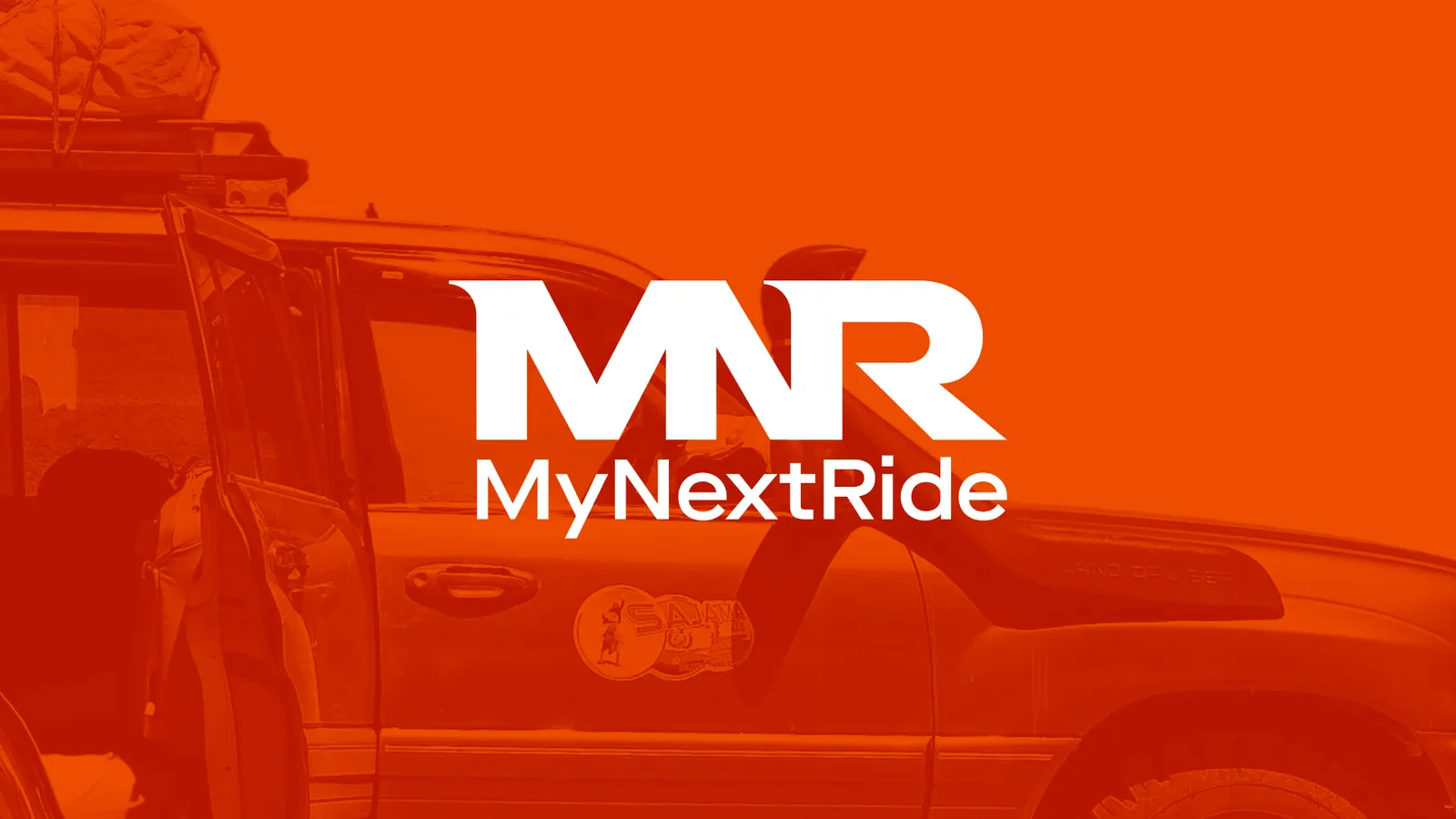
The heavy, engineered MNR letterforms feel like equipment you can trust: sturdy and compact. The angular peaks of the M and N suggest terrain and wayfinding. The open sweep of the R suggests a road and a turn: movement with control.
The monogram on its own carries the brand at small sizes: app icons, favicons, social avatars and inspection badges. A secondary horizontal lock-up keeps the brand legible in headers and navigation bars, and the wordmark is set in a clean, geometric sans serif with no embellishment.
Colour
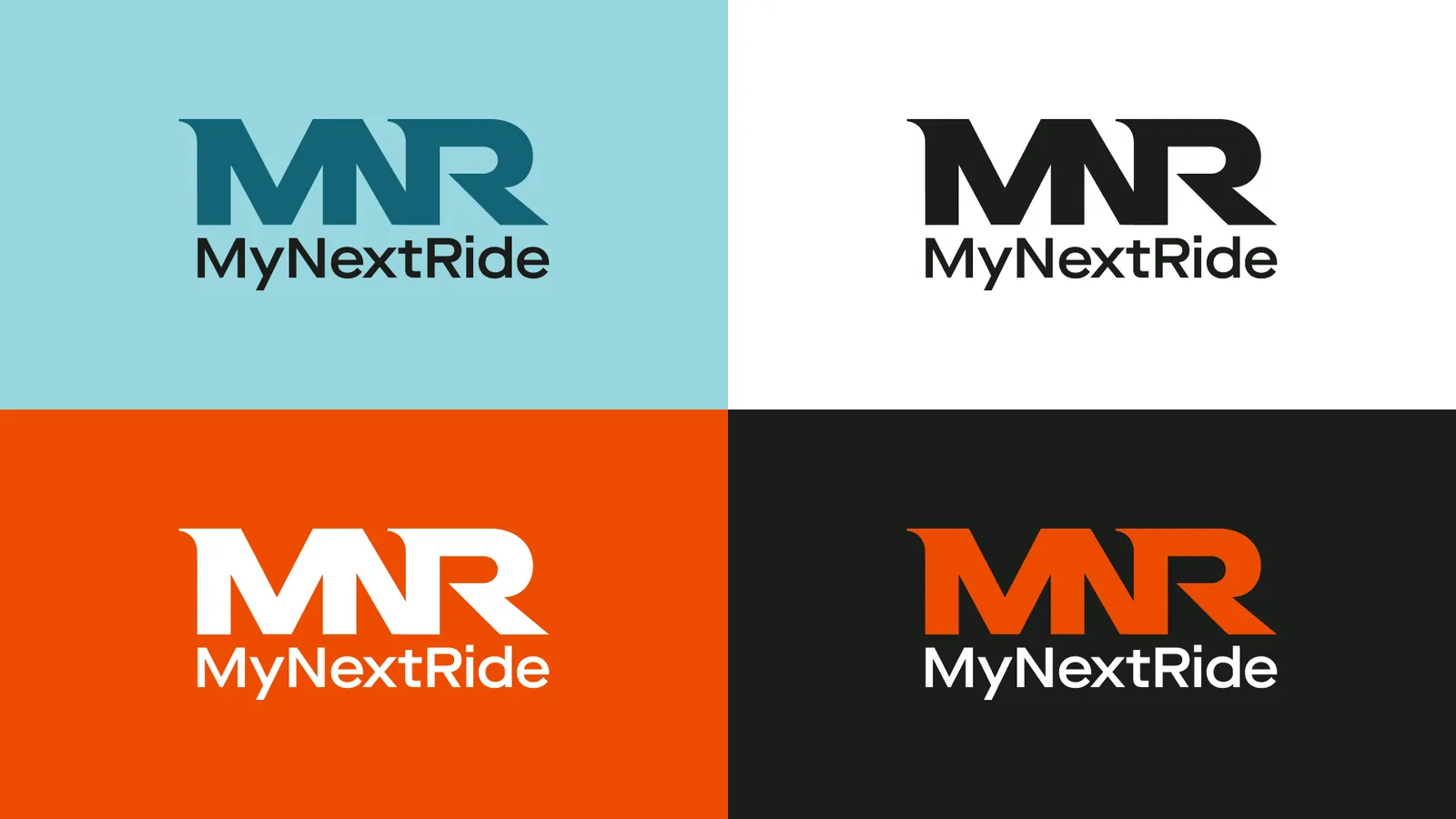
Charcoal Ink and Deep Teal lead the palette. Charcoal brings calm authority, no theatre. Teal combines the steadiness of blue with the pragmatism of green, and suggests verified facts, fair dealing and knowledgeable guidance. Light Grey feels like a tidy workshop bench: everything visible, nothing hidden.
Burnt Orange is the clearest example of the strategy at work: "more Kalahari dust than alarm siren". The category defaults to red. MyNextRide's accent is warm enough to carry energy and adventure, and different enough to read as a deliberate departure from the dealership forecourt. It is reserved for moments of decision or emphasis and never dominates a composition.
Typography
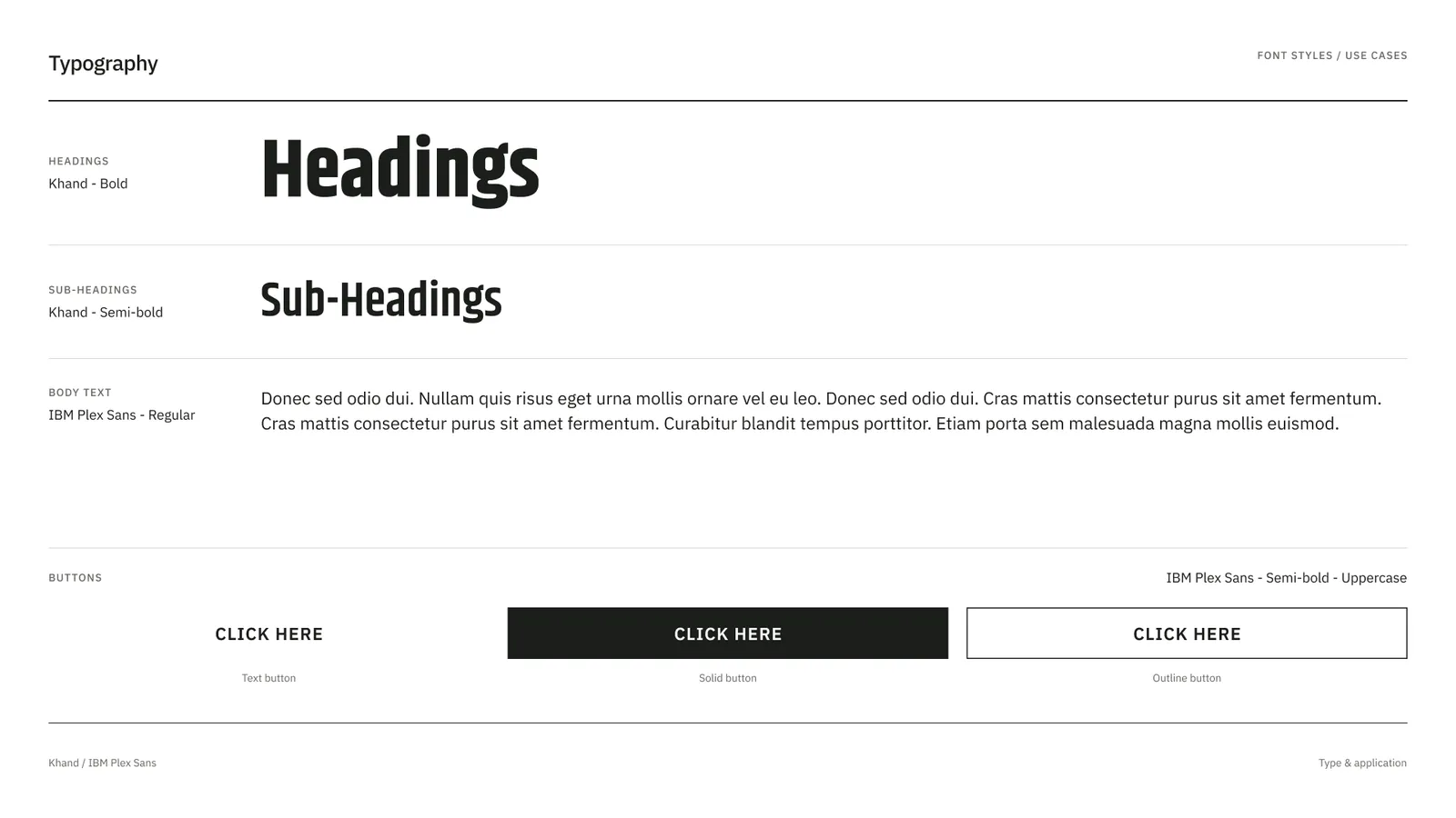
Khand, a compact, squared typeface, echoes the engineered geometry of the MNR monogram in headings. IBM Plex Sans, a highly legible sans serif, carries the inspection details, cost breakdowns and specifications. Khand provides the confidence, and IBM Plex Sans provides the clear explanation.
What We Learned
When a category has a costume, the avoid list is a brief
Writing down exactly what MyNextRide would not use did more to shape the identity than any moodboard. Each decision afterwards had a clear test.
A specialist can't borrow the trust of the brand it specialises in
MyNextRide's entire proposition is Toyota expertise, and Toyota's assets were the one thing it could not use. Expertise had to be shown through clarity, tone and evidence instead.
Keep what the client already owns
The client's early explorations contained a lot that belonged to the category, and one thing that belonged to them: the MNR initials. Keeping the monogram and rebuilding everything around it gave the client an identity that felt familiar from day one.
Closing Reflection
Toyota buyers already believe a Land Cruiser can cross the Kalahari. Their real question is whether the one on their screen will. A louder logo won’t give them peace of mind, so MyNextRide’s brand stays quiet. It keeps only what a careful buyer looks for: a steady tone, the full picture, and the sense that an expert is on their side.
MyNextRide Website: www.mynextride.co.za