Case Study: Octoco
Project Overview
The client
Octoco is a fifty-person multidisciplinary engineering firm across two offices, with three practices (software, hardware and embedded, CTO and investment advisory), more than a dozen ventures behind it, and a venture studio, Yenza.
The project
Mild brand refinement, information architecture, web design and bespoke development (a full rebuild of octoco.ltd).
The trigger
Octoco's website hadn’t been aligned with their refined brand, which created a notable dissonance, and for an audience that includes investors doing due diligence and senior engineers weighing up an offer, inconsistency could read as a signal about how the rest of the business is run.
The Brief and the Reframe
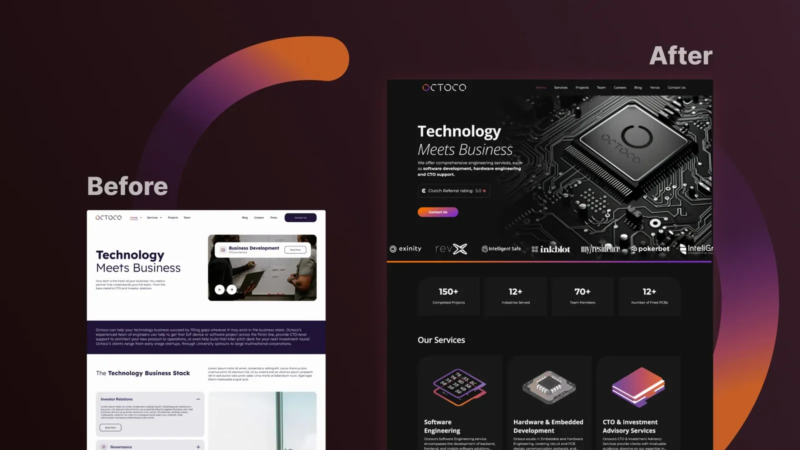
Octoco asked for two things: update the site to reflect the current brand, and simplify it.
"Simplify" is one of the most frequently misdiagnosed briefs in web design. It's usually heard as a visual instruction, but here it wasn't just that. The old site didn't feel complicated because it looked busy, but it made the visitor do the sorting between ten service lines, which were all presented as equals, so every arrival on the site began with a categorisation task before they could reach a decision.
Those service lines weren't ten things clients buy, merely ten things Octoco does, arranged roughly the way the firm is internally structured. Engineering companies describe themselves by discipline while clients decide by outcome. So the brief wasn't really to "make it simpler", but rather to stop publishing the org chart.
Discovery: Three Journeys, Not One Audience
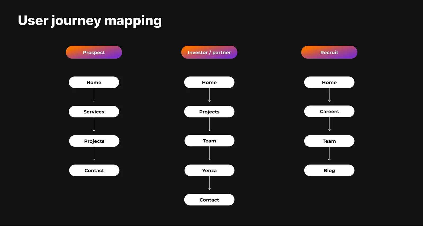
The new site structure had to serve three people arriving with three different questions.
- The prospect: Home → Services → Projects → Contact. Can you do the thing I need, and have you done it before?
- The investor or partner: Home → Projects → Team → Yenza → Contact. Is this a serious operation with a real track record and a real bench?
- The recruit: Home → Careers → Team → Blog. Who would I be working with, and are they any good?
A single page often serves more than one at once, which is why the proof points were placed by journey rather than distributed for visual balance: the Clutch badge in the hero, the repeated Contact CTA, the real org-structured team page, and the named client testimonials.
The Strategy
Every element on the site had to answer one question: which of the three journeys does this serve, and at what point in that journey? Anything that couldn't answer clearly was relocated or removed. That single filter is what let us collapse ten services into three, cut a Press page, and still find room to add an entire section for Yenza. Subtraction bought the space for the addition.
Design: The Decisions That Shaped It
The site follows the sequence of a considered B2B decision, because nobody buys embedded firmware engineering on a first visit: awareness → capability → proof → team credibility → contact. Three design decisions carry the rest.
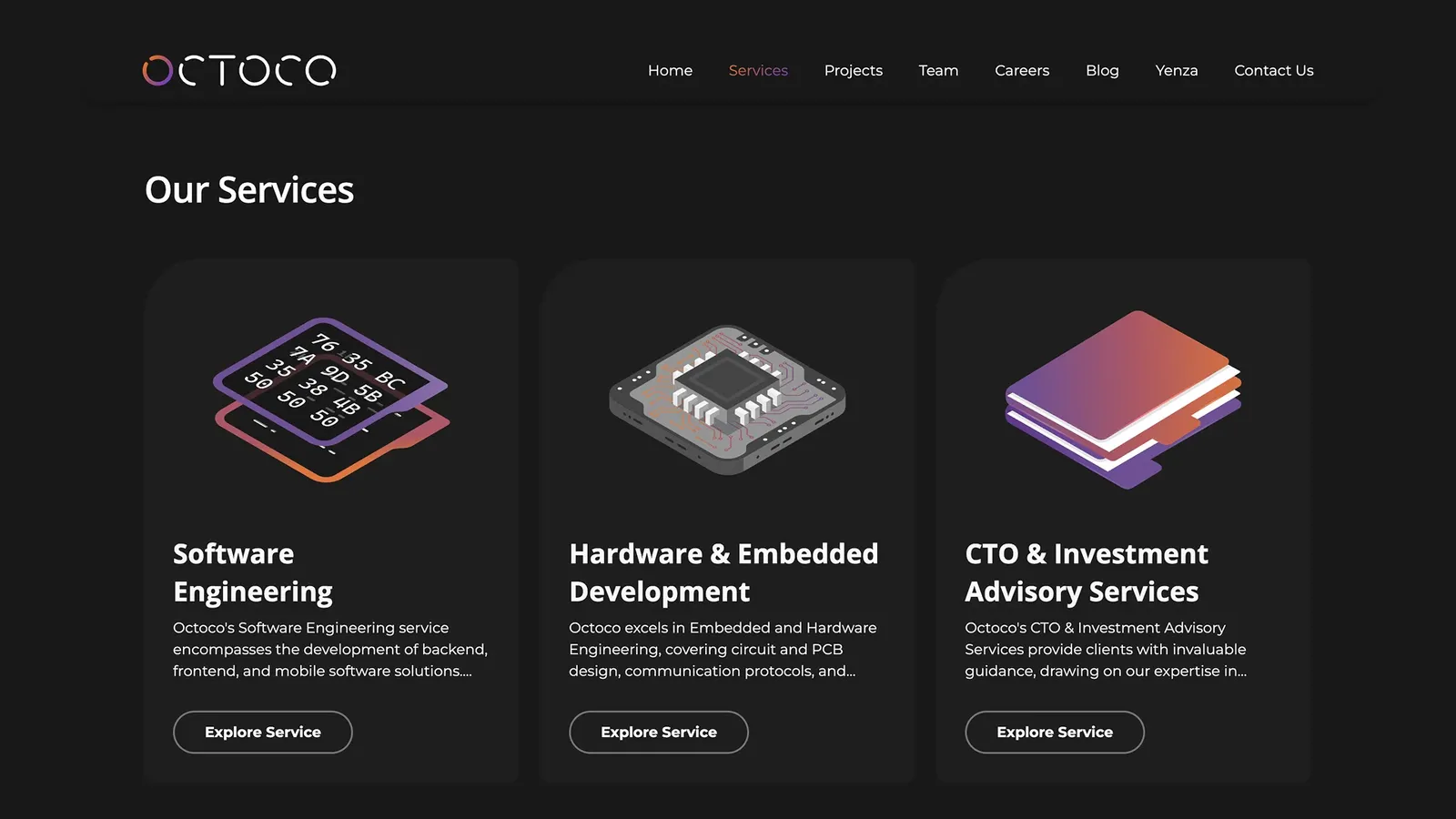
1. Ten services became three pillars.
Software Engineering. Hardware and Embedded Development. CTO and Investment Advisory. The original ten didn't disappear; they became sub-bullets under the pillar they belong to. We considered structuring by audience instead (founders, investors, product teams) but chose capability-led, because Octoco's differentiator is technical range and a capability menu proves that range in three seconds.
2. Projects filter by capability, not chronology or industry.
The Projects page filters by AI, Fractional CTO, Hardware, Machine Learning and Software. A visitor on that page isn't browsing, they're hunting for evidence that Octoco has solved something structurally similar to their own problem. Chronology answers "are they still busy?" Industry answers "do they know my sector?" Capability answers "have they done my kind of hard thing before?" For a technical buyer, that's the real question.
3. Conversion points sit after the trust-building content, not before it.
Contact Us, Explore Service and View Case Study appear once a visitor has seen the services, the proof and the testimonials. We deliberately skipped harder mechanics (Book a Call above the fold, exit prompts, gated content). They work for lower-consideration purchases, but a firm that chases you around its own website reads as a firm with capacity to fill. Restraint is the positioning decision here, not a conversion oversight.
The look
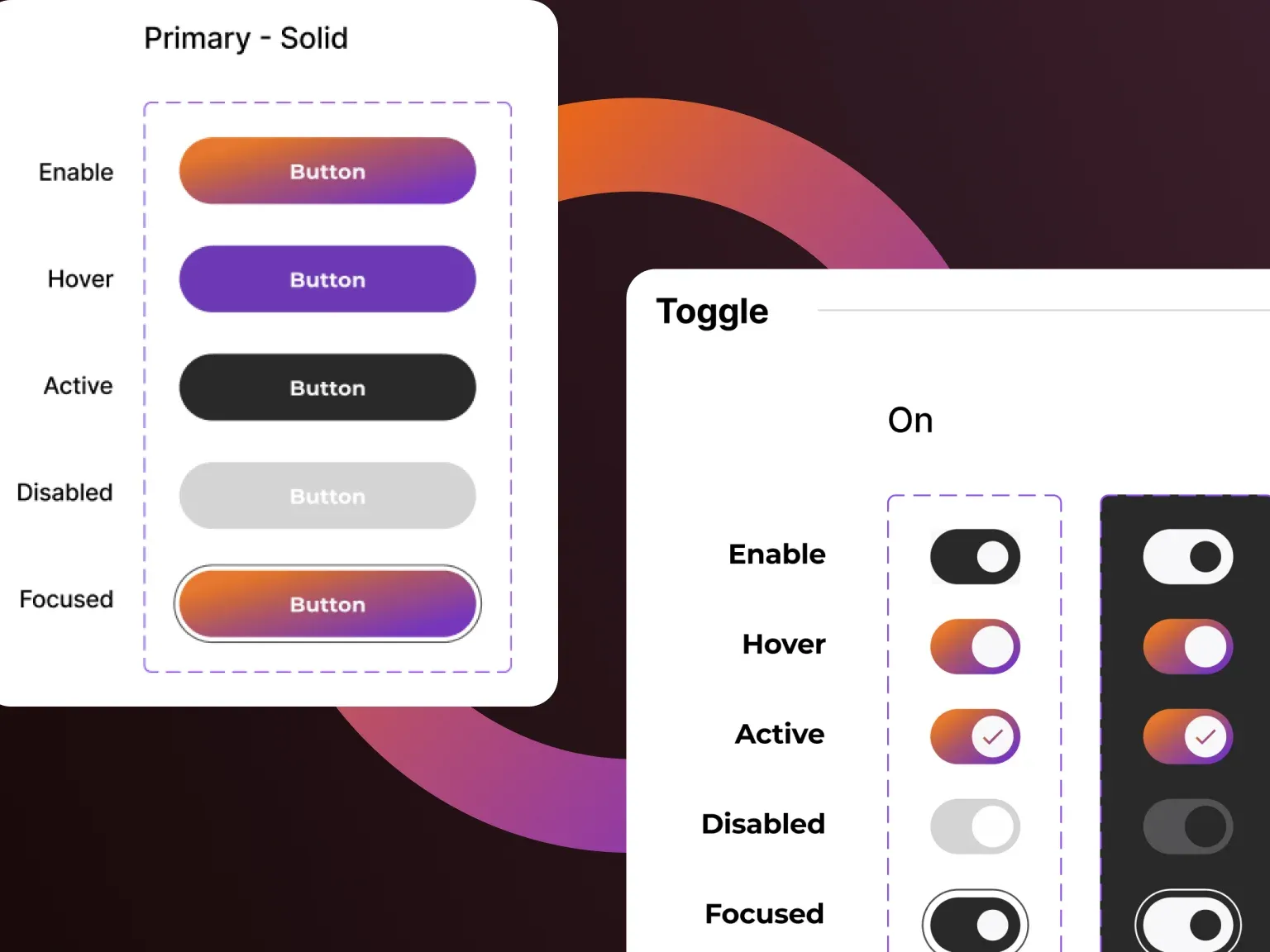
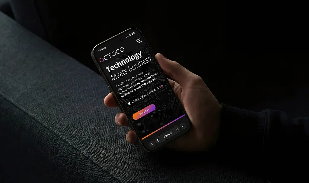
Octoco's refined brand, applied to a digital context in dark mode. The register: a modern engineering consultancy with a strategic edge. Structured, credible, technical, approachable. A component-led system (clear sections, cards, short blocks) keeps it scannable on desktop and stops it overwhelming anyone on a phone, which is where a lot of first, mid-referral visits happen.
What We Learned
When a company lists ten services, it's usually publishing its org chart.
Internal structure feels like the honest way to describe yourself. But a visitor doesn't want a map of how you're organised. They want to know which door is theirs. Grouping isn't a simplification of the truth, it's a translation of it into the language the decision is actually made in.
A website's job isn't to be a complete account of a company.
It's to help a specific person reach a specific decision with as little friction as possible. That meant collapsing ten services into three, removing a page, and using the space it bought to give the newest part of the business somewhere to live. Clearer, not because the site says less about Octoco but because it stopped asking visitors to do the sorting.
Closing Reflection
The instinct on a site like this is to add more content. More services listed, more capability described, more evidence of range, etc. Octoco's range is real and considerable, and the temptation to show all of it is understandable.
But a website's job isn't to be a complete account of a company but to help a specific person reach a specific decision with as little friction as possible. Clear, helpful, easy to trust. The new website doesn’t say less about Octoco, it just makes the visitor do a lot less heavy lifting.