Project Overview
The client
Soulō is Pooja: a holistic wellness and coaching practitioner working across podcasts, coaching and journaling. In her field, Soulō and Pooja are the same thing.
The project
Brand-led web design and bespoke development. A first proper home for a practice that had never had one.
The trigger
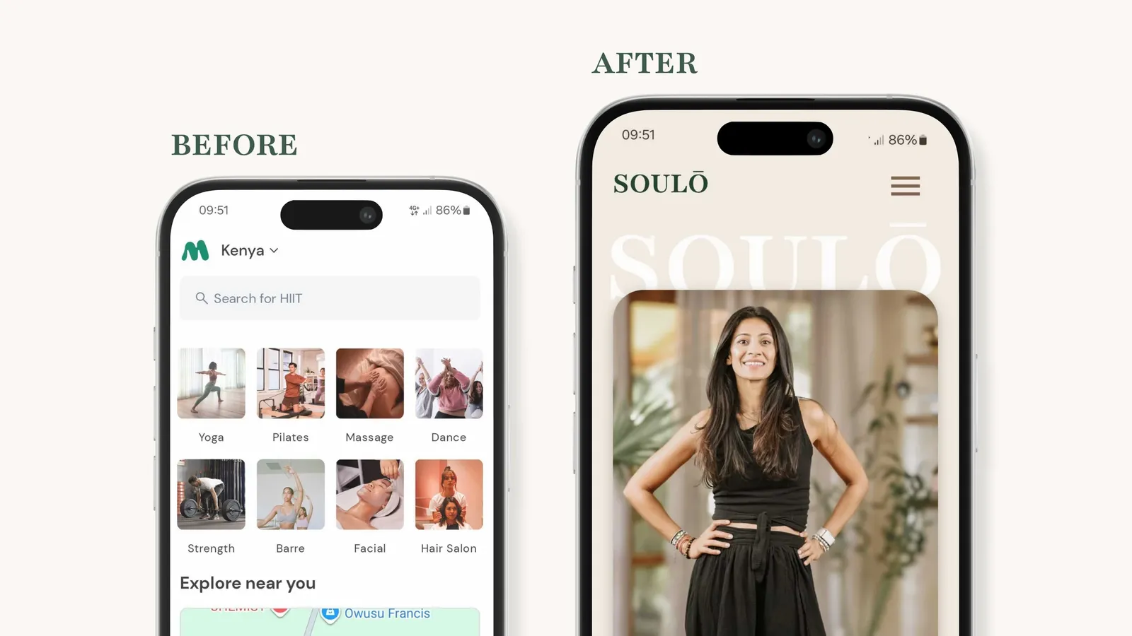
Pooja had no website, only a scattering of platforms: Mindbody for scheduling (a shared space she rents alongside competitors), socials for reach, podcast platforms for her audio. Nowhere pulled it together. Every new client had to be walked through her full offering by hand, and most never saw the whole picture. The frustration of presenting herself piece by piece, in a space she had to compete inside, is what finally moved this from "someday" to "now".
The Brief and the Reframe
Pooja asked for an all-in-one platform: somewhere to gather her offerings and link out to Spotify, socials and the rest. A container for what Soulō is.
The wellness market is crowded with people who share Pooja's training and her services. In that market, a tidy directory of offerings makes you legible, not chosen. What separated Pooja wasn't the list of things she does. It was that she hadn't only studied what she offers, she'd lived through serious lows and come out the other side. Her story was the reason to choose her, and a container has nowhere to put a story.
So the brief wasn’t "gather her links in one place" but rather "give a stranger a reason to trust her before they've spent a cent." The client's own summary of the shift, by the end of discovery: from we need a separated platform to we need a completely different conversation with our audience.
Discovery: Designing for the State the Visitor Arrives In
Two findings shaped everything that followed.
The category all looks the same
Most holistic wellness sites in Kenya run on the same template: stock candles, lotus flowers, and the practitioner buried somewhere behind the services. Nobody was designing for the emotional state a visitor is actually in when they arrive on a site like this. People seeking coaching around mental and emotional difficulty are hesitant by default, wary of spending money on something that can't promise relief. A wall of services speaks to none of that.
Her hesitation had a specific shape
The block wasn't "which service do I want?" It was "can I trust this person with something painful?" That reframed the hierarchy entirely. The job of the homepage wasn't to route people to offerings. It was to put a face to the name and let a visitor feel, quickly, that Pooja had stood where they're standing.
Because the subject matter runs as deep as cancer and grief, we brought a copywriter into discovery. On topics this sensitive, the wrong word doesn't just miss, it breaks trust. The copy needed to carry weight without tipping into either clinical distance or spiritual cliché.
The Strategy
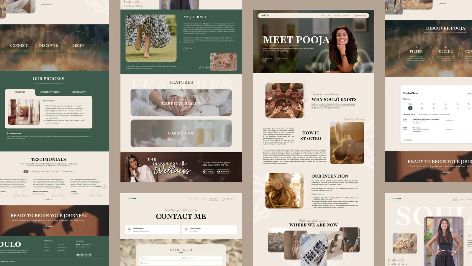
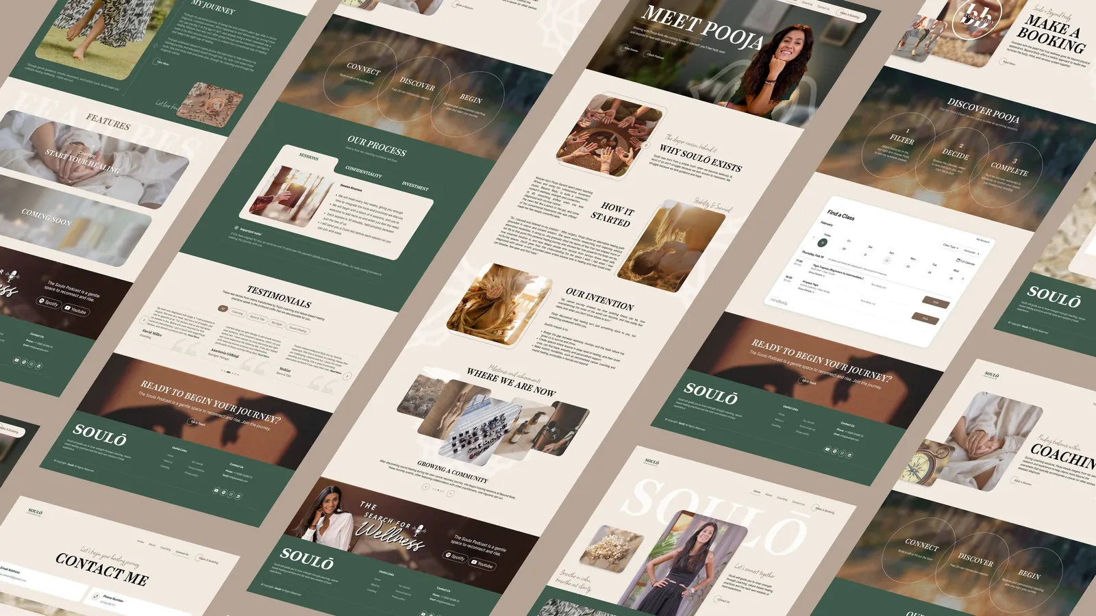
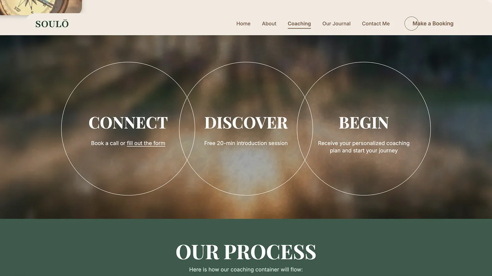
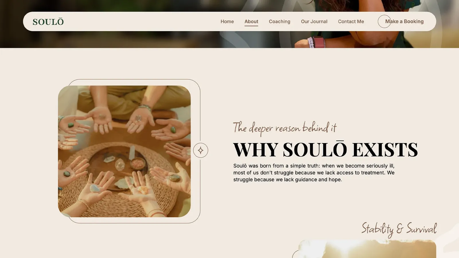
One organising idea governed every decision: the site should be read like a novel of Pooja's life. You enter on her face, read a short version of her story, and move through the pages as though turning chapters, from where she was, to who she is now, to what she offers. Story first, services second, because in this market the story is what makes the services worth considering.
A practical constraint shaped delivery, worth naming honestly: Pooja was mid-move and still defining some offerings, so a few requested features had no content to sit on yet. Rather than stall, we phased the build, launching her live site now and archiving hours to add those features once she could feed them.
Design: The Decisions That Shaped It
1. The homepage leads with the person, not the offer
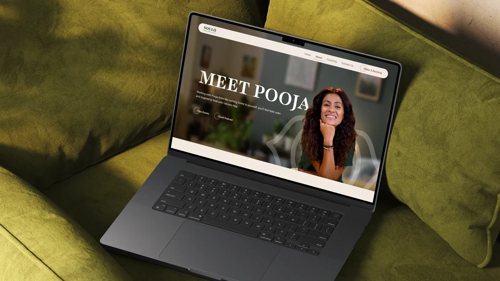
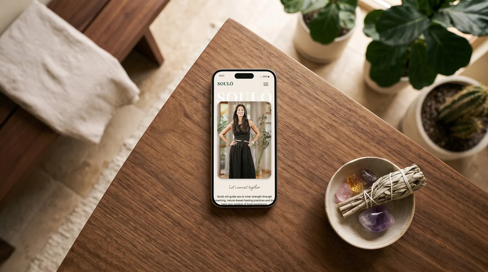
You land on Pooja's face and the opening of her story, not a services grid. In a category where the practitioner is usually buried, surfacing her first is the whole differentiation strategy expressed in a single layout choice. It answers the visitor's real question ("can I trust you?") before asking them to consider the transactional one ("which package?").
2. One idea per section. No competing calls to action
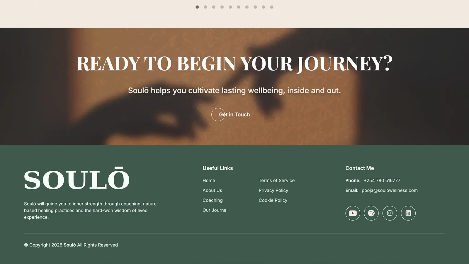
Each screen presents a single choice or thought, then hands you to the next. Most sites stack CTAs and let them fight for attention. We took the opposite view: a visitor arriving in a tender frame of mind shouldn't be asked to choose between five things at once. The pacing mirrors the reading of a story, one beat at a time, which keeps people moving through rather than dropping off the homepage.
3. Typography treated as narrative, not decoration
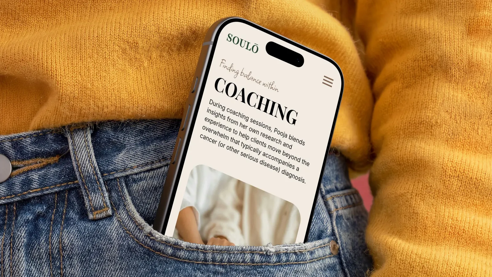
The type is set to read like written storytelling, and sized to be comfortable for older adults, who make up a real part of Pooja's audience. Readability here isn't an accessibility footnote bolted on at the end. It's central to the strategy, because the whole site depends on people actually reading her story rather than skimming past it.
The look
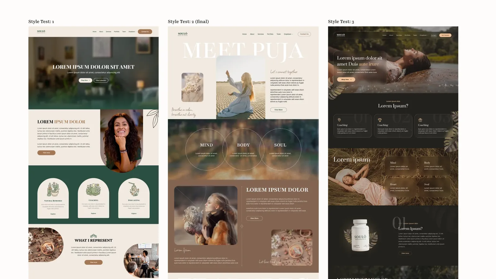
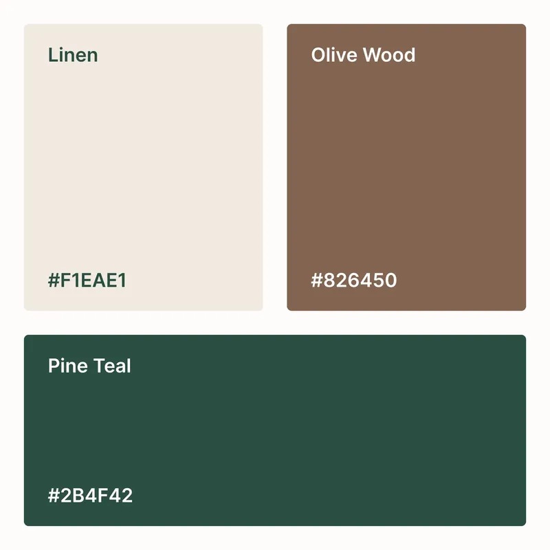
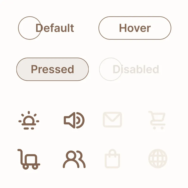
Warm, hand-crafted, and unmistakably personal: illustrated flourishes, sparkle accents, dividing lines and large photographic compositions that carry Pooja's warmth and set the site apart from the stock-photo sameness of the category. Rich and image-led on purpose, because the feeling of care in the design is itself part of the promise the practice makes.

What We Learned
When the whole category sells the same feeling, the person is the product
Pooja's competitors offer near-identical services with near-identical training. The one thing none of them can copy is her particular story. Designing the site to lead with that, rather than tuck it into an "about" page, is what turned a directory of offerings into a reason to choose her.
Design for the emotional state at the door, not the sitemap
The most useful discovery insight had nothing to do with features. It was recognising that a visitor to a wellness site arrives hesitant and a little guarded, and that every early decision (what they see first, how much they're asked to choose, how the words are pitched) should answer that state before it answers the business's goals. Get the emotional read right and the navigation almost designs itself.
A story-led site earns its structure from a flow map
The honest reflection from our side: when content shifts mid-project, as it did here, a narrative site feels the disruption more than a modular one, because sequence is the whole point. Mapping the full story flow before design begins is what keeps new content easy to place. It's the thing we'd lock in even earlier next time.
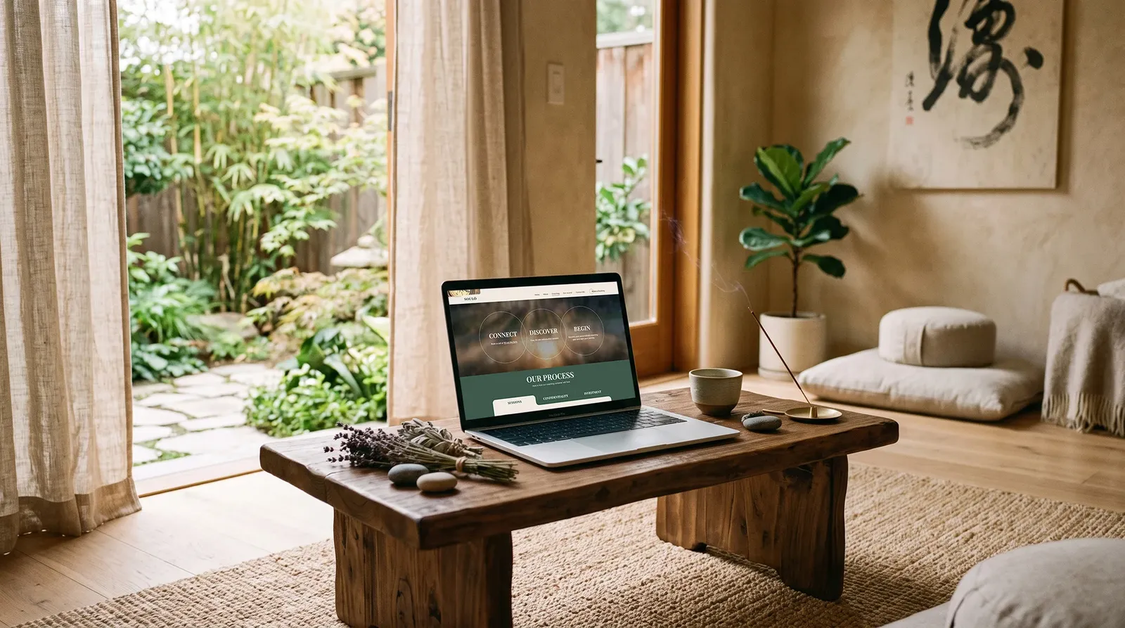
Soulō website: www.soulowellness.com